Wikipedia:Featured picture candidates
From Wikipedia, the free encyclopedia
|
Featured pictures are images that add significantly to articles, either by illustrating article content particularly well, or being eye-catching to the point where users will want to read its accompanying article. Taking the adage that "a picture is worth a thousand words," the images featured on Wikipedia:Featured pictures should illustrate a Wikipedia article in such a way as to add significantly to that article, according to the featured picture criteria. If you believe an image should be featured, please add it below to the current nominations section. Conversely, if you believe that an image should be unfeatured, add it to the nomination for delisting section. For promotion, if an image is listed here for seven days with four or more supporting votes (including the nominator), and the consensus is in its favor, it can be added to the Wikipedia:Featured pictures list. Consensus in Featured picture candidates is generally regarded to be a two-third majority in support. Note however that anonymous votes are generally disregarded, as are votes of sockpuppets. If necessary, decisions about close votes will be made on a case-by-case basis. The archive contains all votes and comments collected on this page, and also vote tabulations. If you nominate an image here, please consider also uploading and nominating it at Commons, to help ensure that the pictures can be used not just in the English Wikipedia but on all other Wikimedia projects as well.
|
Featured picture tools: |
|
[edit] How to nominate[edit] Step 1 - EvaluateThe submissions will be evaluated using the criteria listed on Wikipedia:What is a featured picture? Please read the Featured picture criteria before submitting a picture to help cut down on the number of candidates that have a low chance of making it. If you are unsure if your picture will fulfill the criteria, you can add it to Wikipedia:Picture peer review for review. If you feel the submitting process is complicated, you can add it with the following syntax: [[Image:YourImageName.jpg|thumbnail|200px]] to the peer review page (but please do not use this syntax on the Featured Pictures candidate page itself!). [edit] Step 2 - Create subpageCreate a page to place the article on, this page needs to be a subpage of Wikipedia:Featured picture candidates. To create your own subpage, add the title of the image you want to nominate in the bar as a subpage of the given page in the form below and click "create new nomination" (for example Wikipedia:Featured picture candidates/Labrador Retriever). [edit] Step 2.5 - Transclude and link
[edit] Step 3 - Update imageOn the nominated image's page use the 'Edit page' button to add the fpc template like so: {{FPC|title}}. This inserts the featured pictures candidate template, to let the original contributor and other interested parties know that the image is up for voting. [edit] Too complicated?If you are unable to follow the above procedure, add your image to Wikipedia:Picture peer review with the following syntax: [[Image:YourImageName.jpg|thumbnail|200px]], and mention that you would like to submit it, but that you don't know how. If someone else likes it, they will add it to Wikipedia:Featured picture candidates. Again, please do not add images directly to FPC using this syntax. [edit] How to vote
Votes added early in the process may be disregarded if they do not give any reasons for the opposition. This is especially true if the image is altered during the process. Editors are advised to monitor the progress of a nomination and update their votes accordingly. Prior to voting, the image should be assessed on its quality as displayed at full size (high-resolution). Please note that the images are only displayed at thumbnail size on this page. The thumbnail links to the image description page which, in turn, links to the high-resolution version. Please remember to be civil, not to bite the newbies and to comment on the image, not the person. [edit] Editing candidatesIf you feel you could improve a candidate by image editing, please feel free to do so, but do not overwrite or remove the original. Instead, upload your edit with a different file name (e.g. add "edit" to the file name), and display it below the original nomination. Edits should be appropriately captioned in sequential order (eg, Edit 1, Edit 2, etc) and describe the modifications that have been applied. [edit] Is my monitor calibrated correctly? In a discussion about the brightness of an image, it is necessary to know if the computer display is properly adjusted. Displays differ greatly in their ability to show shadow detail. There are four dark grey circles in the adjacent image. If you can discern three (or even four) of the circles, your monitor can display shadow detail correctly. If you see fewer than three circles, you may need to adjust the monitor and/or computer display settings. Some displays cannot be adjusted for ideal shadow detail. Please take this into account when voting.  On a gamma-adjusted display, the four circles in the color image blend into the background when seen from a few feet away. If they do not, you could adjust the gamma setting (found in the computer's settings, not on the display), until they do. This may be very difficult to attain, and a slight error is not detrimental. Uncorrected PC displays usually show the circles darker than the background. Note that on a LCD display (laptop or flat screen) the viewing angle strongly affects these images. Click on the images for more technical info. |
||
- To see recent changes, purge the page cache
- Your comments are also appreciated on images at Picture peer review.
[edit] Current nominations
[edit] Common Jassid Nymph


Pushing the envelope again in regards to extreme macro. This time the specimen clocks in at around 10mm - absolutely tiny! Before focus brackets get mentioned I just want to remind people that this was taken in the wild on a breezy day so this was a moving target! Taken in Swifts Creek, Vic, in January 2007
The alternative, though not as close up, better shows the symbiotic relationship between this species and Meat Ants.
Appears in: Leafhopper and Membracoidea
- Support Self Nom. --Fir0002 06:46, 9 April 2007 (UTC)
- Comment: I like the alternative (not the original) a lot, but cannot fully support it because the ant is cut off, and there is a cut-off leg (of this, or another nymph?) on the left. A great shot of a difficult subject, for sure! --Janke | Talk 07:18, 9 April 2007 (UTC)
-
- Fair enough, I've uploaded a version with less cropping, but due to the congested way these insects live it's pretty much impossible to isolate one. I can provide an even less cropped image with more of the LHS nymph if you want - or I can have a shot at cloning it out :-) --Fir0002 08:02, 9 April 2007 (UTC)
[edit] USMC Marathon

- Reason
- Great. High quality.
- Articles this image appears in
- Marathon, Marine Corps Marathon
- Creator
- A work of the United States Federal Government
- Support as nominator — Tomer T 12:19, 8 April 2007 (UTC)
- Weak oppose Sorry. =( Great pic overall, but there a few significant technical problems. The pic looks blurry and a bit hazy. There are also some artifacts, especially outlining the runners. Will support if a better version is found. Jumping cheese Cont@ct 13:46, 8 April 2007 (UTC)
- Oppose Unexciting photo of a replicable event. Witty lama 16:14, 8 April 2007 (UTC)
- Oppose Poor quality (looks upsampled, tilt, composition). As Witty lama said, the event is replicable. Other pictures could easily surpass this one. Thegreenj 16:29, 8 April 2007 (UTC)
- Oppose Not very interesting, And the outline around the runners... 8thstar 16:36, 8 April 2007 (UTC)
- Oppose Not striking enough - Adrian Pingstone 18:13, 8 April 2007 (UTC)
- Oppose You might want to give Wikipedia:Picture peer review a shot. Your last nominations have been a far cry from featured quality. ~ trialsanderrors 23:31, 8 April 2007 (UTC)
- Ouch...sounds a bit harsh. Jumping cheese Cont@ct 03:51, 9 April 2007 (UTC)
- No. I think people should have a good idea which pictures could make FP before they nominate them here, and I don't think Tomer has. That's what peer review is for, to get a better idea which pictures might pass. ~ trialsanderrors 04:06, 9 April 2007 (UTC)
- Ouch...sounds a bit harsh. Jumping cheese Cont@ct 03:51, 9 April 2007 (UTC)
[edit] Mission San Xavier del Bac

- Reason
- I think it's a great picture.
- Articles this image appears in
- Mission San Xavier del Bac, Spanish missions in Arizona, Architecture of the United States
- Creator
- jimfrazier, Flickr
- Support as nominator — Tomer T 10:36, 8 April 2007 (UTC)
- Weak oppose,great light, but size and scaffolding bother me. --Dschwen 11:01, 8 April 2007 (UTC)
- Oppose As per Dschwen. Witty lama 16:15, 8 April 2007 (UTC)
- Oppose Tilted - Adrian Pingstone
- Oppose The scaffolding, 8thstar 22:04, 8 April 2007 (UTC)
[edit] Akaka Falls

- Reason
- Wonderful
- Articles this image appears in
- Akaka Falls State Park
- Creator
- Richard J Kruse III and Lisa C. Rosprim
- Support as nominator — Tomer T 22:27, 7 April 2007 (UTC)
- Oppose Blown headlights everywhere! The sky is completely white, and the waterfall, the subject of the photograph, is blown to the point where almost all detail is lost. Combined with visible JPG artifacts, general overexposure, and a general lack of sharpness, this simply does not pass featured criteria. Thegreenj 22:33, 7 April 2007 (UTC)
- Oppose Per Thegreenj; I couldn't have said it better myself.--HereToHelp 23:59, 7 April 2007 (UTC)
- Oppose Per Thegreenj 8thstar 00:53, 8 April 2007 (UTC)
 Oppose - severely blown highlights, blurry, colour fringing. —Vanderdecken∴ ∫ξφ 08:14, 8 April 2007 (UTC)
[edit] Along the River During Qimgming Festival
- Reason
- This enormous 18th century Chinese panorama painting is simply incredible. In many ways it is slightly superior to its original, painted first by Zhang Zeduan (1085–1145 AD), while this painting is a more elaborately-detailed reproduction done 7 centuries later (during the Qing Dynasty). In my opinion, it is one of the greatest panorama paintings ever made.
- Articles this image appears in
- Panoramic painting, Panorama, Along the River During Qingming Festival
- Creator
- 百楽兎
- Support as nominator — PericlesofAthens 01:36, 6 April 2007 (UTC)
- Oppose there is some pixilation/artifacts, and some minor stitching errors, but there's a big stitching error between a fourth and a third of the way from the left, just to the right of a bridge.--HereToHelp 21:14, 7 April 2007 (UTC)
- Oppose Iconic, but certainly could be better. JPEG artifects too appearant, and why is there a break near the right? --antilivedT | C | G 01:47, 8 April 2007 (UTC)
- Weak Support I can see what the above users are saying about the artifacts. But it illustrates the articles well. ~ Arjun 02:10, 8 April 2007 (UTC)
- Oppose Great panorama, poor quality jpg, especially compared to the National Palace Museum version. ~ trialsanderrors 02:38, 8 April 2007 (UTC)
- Oppose - Amazing image, but bad JPG compression - I may make an edit from the original source if I have time, but don't count on it. —Vanderdecken∴ ∫ξφ 08:11, 8 April 2007 (UTC)
- Oppose per above. So who wants to spend hours cobble together the image from the museum site? (and don't tell me to fix it :( --gren グレン 18:19, 8 April 2007 (UTC)
[edit] Marine sextant

- Reason
- This is a revised version of an animation already nominated in WP:FPC. I believe it helps to better understand the basic principle of the instrument and illustrates cleary its use in celestial navigation. The picture file contains a detailed explanation of the numbered frames.
- Articles this image appears in
- Sextant, celestial navigation
- Creator
- Joaquim Alves Gaspar
- Support as nominator — Alvesgaspar 17:36, 7 April 2007 (UTC)
- Comment is there a way to avoid artifact when WikiMedia thumbnails it? gren グレン 18:08, 7 April 2007 (UTC)
- Support per Commons discussion. ~ trialsanderrors 20:08, 7 April 2007 (UTC)
- Support. Shame about the artifacts in the thumbnail but very good quality and useful for the article(s). Diliff | (Talk) (Contribs) 16:38, 8 April 2007 (UTC)
- Support Very informative Jellocube27 21:29, 8 April 2007 (UTC)
- Support Much improved! Just one suggestion, there is actually one last step: 5) read the elevation from the index bar. You might have the measurement "40°" circled briefly. It would make clear the purpose of the device. --Bridgecross 02:38, 9 April 2007 (UTC)
[edit] Larrys Creek Covered Bridge

- Reason
- Appears to meet the FPC criteria. In WP:PPR User:Dincher wrote "I really like the simplicity of it. The photo shows the structure of the bridge. It shows how the bridge works from an exterior view. Most covered bridges look quaint and rustic, but the photos don't show the arch that is the key to holding the bridge. This photo does. As an added bonus the photo also shows the effects that a creek has on the creek bank. Note that Larrys Creek is in its normal stream bed in this photo, but that the effects of the recent winter melt can be seen in the grasses that have been flattened on the creek bank. Looking at the picture tells me a story."
- Articles this image appears in
- Larrys Creek (a featured article), Cogan House Township, Pennsylvania, History of Lycoming County, Pennsylvania
- Creator
- Photo by User:Ruhrfisch, March, 2006.
- Support as nominator — Ruhrfisch 14:04, 7 April 2007 (UTC)
- Weak Support: I don't like the trees getting in the way of the bridge in the right-hand side. ~Steptrip 15:26, 7 April 2007 (UTC)
- Oppose By no means is this a bad photograph. It nicely illustrates the bridge. However, if you take a look at the current featured pictures of architecture, the bar for a featured picture is higher than to what this photograph reaches. It is a nice picture, really, but it just does not have the crisp feel or the wow factor that featured pictures demand. If you are serious about getting a picture of this bridge featured, try a different angle (I find the tilt as well as the trees distracting), and take several shots to try to capture the "feel" of the bridge. A sharper focus would help, too. Thegreenj 16:08, 7 April 2007 (UTC)
- Oppose I agree with J, not inspiring when compared to current FPs. |→ Spaully°τ 16:18, 7 April 2007 (GMT)
- Oppose Not very interesting, and the trees are in the way. 8thstar 20:46, 7 April 2007 (UTC)
[edit] American Football

- Reason
- Spectacular photo of players playing of the most common sports in the US, American Football.
- Articles this image appears in
- American Football, Pro Bowl, United States, Culture by region, 2006 Pro Bowl, Roy Williams (safety)
- Creator
- Cpl. Michelle M. Dickson
- Support as nominator — Tomer T 10:08, 7 April 2007 (UTC)
- Comment - I agree, it's an important American sport, but the picture is pretty blurry, especially when compared to sharper photos with faster-moving subjects.-129.170.50.27 11:25, 7 April 2007 (UTC)
- Please sign in before voting. —Vanderdecken∴ ∫ξφ 14:03, 7 April 2007 (UTC)
- Comment - I agree, it's an important American sport, but the picture is pretty blurry, especially when compared to sharper photos with faster-moving subjects.-129.170.50.27 11:25, 7 April 2007 (UTC)
- Oppose - a bit blurry for my liking, even if it is an action shot. And I see JPG artifacts, too. —Vanderdecken∴ ∫ξφ 14:03, 7 April 2007 (UTC)
- Oppose blury. It is interesting that we dont have many really good sports shots considering they are some of the most photographed events. -Fcb981 15:25, 7 April 2007 (UTC)
-
- I suspect that's because the quality of sports photography we'd expect for FP requires a very fast lens and access to the touch-line (rugby terminology... what do they call it in American Football?), which is pretty much reserved to pro sports photographers whose livelihood depends largely on them not releasing their work under free licences. --YFB ¿ 18:03, 7 April 2007 (UTC)
- Oppose Motion blur.--HereToHelp 17:50, 7 April 2007 (UTC)
- Oppose Per above. --YFB ¿ 18:03, 7 April 2007 (UTC)
[edit] MSM sunset


- Reason
- This is a beautiful capture. More importantly, detailed pictures of Mont Saint-Michel are rare, one usually finds pictures taken from hundreds of yards away. Also, the minimal noise level (despite the light in this shot) is difficult to achieve.
- Articles this image appears in
- Mont Saint-Michel
- Creator
- User:Benh
- Support as nominator — DMCer 09:00, 7 April 2007 (UTC)
OpposeWhile it may have been a tough exposure, the lighting is blown in places as well as the shadows in others. What a beautiful place though -Fcb981 15:20, 7 April 2007 (UTC)- Weak oppose, it is blown out in places and that is something you get in night shots... and it's surprisingly crisp, but I don't think this image really does a great job of representing the subject. Part of it is that maybe for old structures like this night shots are out of place because the lighting doesn't fit, and part of it is because it's difficult to see the main structures. Definitely a lovely place. gren グレン 18:11, 7 April 2007 (UTC)
- Comment I'm user Benh from commons and the author of the picture. I uploaded another version of the candidate which has brighter dark parts since it was taken a few minutes before. It's also post processed to help. I also rotated it slightly to the left since it was tilted. Unfortunately, there's a car coming the other way which spoils the picture... Blieusong 12:28, 8 April 2007 (UTC)
- Support original The headlights in the lighter version does spoil it. Although the original does have a few blown highlights, it's not more than expected from a long exposure night shot. The lighting also creates a more dramatic images compared to the lighter one. Besides the few blown highlights, the images suffers from no other significant problems. Very unique and encyclopedic pic. Jumping cheese Cont@ct 14:00, 8 April 2007 (UTC)
- Comment I've found another picture, taken after the first two ones, which may addresses most of the flaws mentionned above. Blieusong 17:46, 8 April 2007 (UTC)
- Support Edit 3 (My own) I think it looks good. more detail in the bright areas and more in the dark. -Fcb981 19:31, 8 April 2007 (UTC)
- Weak Support Edit 3, it looks quite good this way, only some bits are still a little bright. If it were any darker though the other bits would be too dark, so I suppose this is the best that can be done. typhoonchaser 06:48, 9 April 2007 (UTC)
[edit] Events in early ballooning and parachuting history


- Reason
- Another find from the Library of Congress archives in high quality, with high enc (used in 20+ articles and today's "Did you know?") and high entertainment value. Proposed caption:
-
Two sets of late 19th Century collecting cards, depicting historical events in ballooning and parachuting history from 1783 to 1846. The cards show first flights, military accomplishments, triumphs and tragedies, such as the death of Tom Harris in 1824, who sacrificed his life when his balloon lost altitude and threatened to kill Harris and his fiancée.
- For the accuracy of the depicted events, I recommend reading the article on Sophie Blanchard.
- Articles this image appears in
- Both sets: Balloon (aircraft)
- 1st Series – 1,2,4: Montgolfier brothers; 3: Gas balloon; 4,8: Jean-François Pilâtre de Rozier ; 5: Jacques Charles; 6: Louis-Bernard Guyton de Morveau; 7: Jean-Pierre Blanchard; 8: Aviation accidents and incidents; 9: Surveillance aircraft; 10: Battle of Fleurus (1794), History of military ballooning; 2,4,5,7,10: Timeline of aviation - 18th century.
- 2nd Series – 1: Battle of Mainz; 2: List of early flying machines; 3: Louis-Sébastien Lenormand; 4: André-Jacques Garnerin; 5: Joseph Louis Gay-Lussac, Jean-Baptiste Biot; 6: First French Empire; 7: Sophie Blanchard; 2,4: Timeline of aviation - 18th century; 5,8,9,10: Timeline of aviation - 19th century.
- Creator
- Romanet & cie., c. 1890–1900
- Support as nominator — trialsanderrors 03:28, 7 April 2007 (UTC)
- Support as a set of individual images Looks good but I think it should be prmoted as a set of all the individual cards, not 2 overviews of the cards. --antilivedT | C | G 03:38, 7 April 2007 (UTC)
- So who's gonna tag them all.. :-) ? I'm ok with it, but even featured sets need "lead pictures" that get the FP tag. ~ trialsanderrors 04:56, 7 April 2007 (UTC)
- Comment - I agree, but the individual cards won't make the size requirements... are we ok to waive that since it's a set? If there's consensus in that direction, then I'll support. tiZom(2¢) 04:27, 7 April 2007 (UTC)
- They're 972 × 1422 pixels each, that's far above minimum size. ~ trialsanderrors 04:48, 7 April 2007 (UTC)
- Comment, what exactly is supporting as a set? Do we have a way to deal with that... feature picture sets? I would support as that if there is a way to deal with it... because I don't think having this many entries of the same type into FP is a good way of dealing with it. gren グレン 05:01, 7 April 2007 (UTC)
- See thread on talk page. Bezier curves has just been promoted as the first official featured set, although by all accounts the Mandelbrot set one was our first de facto set. ~ trialsanderrors 05:30, 7 April 2007 (UTC)
- Support and Comment: there are only two images here, Tomtheman and Grenavitar. There are 20 cards, but there are two uncut sets of 10, and so only two pieces of paper and two images. Support because they illustrative, historical, and fun to look at. Enuja 05:28, 7 April 2007 (UTC)
- I think the reason we are talking about sets is because this image isn't the greatest resolution whereas each individual one is. I'm not particularly impressed by the usage of the uncut cards in the balloon article, but I am very impressed by the whole set and how they are used throughout Wikipedia. gren グレン 06:29, 7 April 2007 (UTC)
- There are two versions to the full cards ("higher" and "highest resolution", this is easier to see on Commons). The only reason why I had to downsample the cards is because in the 13 megabyte version it wouldn't create thumbnails. ~ trialsanderrors 07:45, 7 April 2007 (UTC)
- I think the reason we are talking about sets is because this image isn't the greatest resolution whereas each individual one is. I'm not particularly impressed by the usage of the uncut cards in the balloon article, but I am very impressed by the whole set and how they are used throughout Wikipedia. gren グレン 06:29, 7 April 2007 (UTC)
- Support: It doesn't matter to me if the pictures are grouped or not--it's more applicable to the article this way.-129.170.50.27 11:28, 7 April 2007 (UTC)
- Support cut up version By having the individual cards available, the event they portray can be illustrated without 9 other distracting images. As for the "lead" image, it should be the first card (chronologically).--HereToHelp 13:32, 7 April 2007 (UTC)
 Support either together or individually. —dima/talk/ 18:31, 7 April 2007 (UTC)
[edit] Kjosnesfjorden

- Reason
- A beautiful picture of one of the most breathtaking parts of the world; the great Fjords of Norway.
- Articles this image appears in
- Sognefjord
- Creator
- Abubakr Hussain
- Support Illustrates the concept of a fjord pretty well. A bit blurry on the right in the shadowed areas and brownish trees, but I'll overlook that in favor of the overall composition. You should definitely try for FP status on the Commons.--HereToHelp 01:54, 7 April 2007 (UTC)
- Oppose Kjosnesfjorden is not mentioned in the article Sognefjord, so it isn't very encyclopedic. The blurr in the shadows on the right isn't as bad as the blown out highlights of the snow on the right. Enuja 06:07, 7 April 2007 (UTC)
- Oppose Composition is a little boring (too symmetrical IMO) and photographic quality is not good enough for FP. Note the lack of detail and unsharpness in some places. The darker smudge in the sky, at right, should de removed. Alvesgaspar 20:23, 7 April 2007 (UTC)
[edit] US Army Generals

back row (left to right): Stearley, Vandenberg, Smith, Weyland, Nugent;
front row: Simpson, Patton, Spaatz, Eisenhower, Bradley, Hodges, Gerow.
- Reason
- It's a great historical picture of the US Army generals at WWII, and almost all of the generals have high quality articles.
- Articles this image appears in
- Military history of the United States during World War II, United States Army, etc.
- Creator
- US Army; part of the collection of the Office of War Information
- Support as nominator — Tomer T 00:25, 7 April 2007 (UTC)
- Weak support Great enc, not blurry by 1945 standards, high rez, and good composition. It's just old. The black and white is pardonable; but I'd much prefer a dust and scratch removal edit.--HereToHelp 00:52, 7 April 2007 (UTC)
- Support unrepeatable, historical significance, good enough quality. though it could do with a cleanup. Witty lama 01:29, 7 April 2007 (UTC)
- Support that's a pretty good picture of a pretty incredible group of people in the same shot. gren グレン 04:46, 7 April 2007 (UTC)
- Support Would be a super-duper featured pic if it was taken in color. Very encyclopedic and good quality (minimal noise and scratches, but nothing major) for a rare WWII pic. Jumping cheese Cont@ct 09:41, 7 April 2007 (UTC)
- Support I agree With Jumping Cheese. Isn't there a program to put color into black and white pictures, or did I just dream of it? Flubeca 17:37, 8 April 2007 (UTC)
[edit] Jewish badge

- Reason
- Historical value, plus it has no major technical flaws
- Articles this image appears in
- Star of David, Yellow badge
- Creator
- Daniel Ullrich
- Support as nominator — HadzTalk 18:11, 6 April 2007 (UTC)
- Oppose The photograph is noisy and blurred a full size (probably having something to do with an unsteady hand an the 1/8 second exposure). Furthermore, the muddy backgroud is not ideal. A much better photograph could easily be taken under better circumstances. Thegreenj 18:30, 6 April 2007 (UTC)
- The pin is holding it in place, and your notion that more pictures could be taken is laughable. Lets say that you had to wear a badge like that. If, on the very slight chance you survived, wouldn't you want to throw it away? Also when people were forced into internment camps, they had to wear a uniform, not a yellow badge, thus very few of them survived; hence, why it is a museum piece. --HadzTalk 18:52, 6 April 2007 (UTC)
- I had not meant an entirely different badge. Since this example is on display at a museum, a better photograph could be taken, or, better yet, someone with access to the badge could place it under better conditions for a photograph to be taken. Not that any that matters. The picture is of very poor quality. Just because it is a photograph of something rare does not make it featured. The poor quality is compounded by the fact that this example does survive, no matter how many may not, as you suggested, and as such a better photograph may be taken. That said, my oppose stands. Thegreenj 01:31, 7 April 2007 (UTC)
- The pin is holding it in place, and your notion that more pictures could be taken is laughable. Lets say that you had to wear a badge like that. If, on the very slight chance you survived, wouldn't you want to throw it away? Also when people were forced into internment camps, they had to wear a uniform, not a yellow badge, thus very few of them survived; hence, why it is a museum piece. --HadzTalk 18:52, 6 April 2007 (UTC)
- Comments 1. It's a duplicate of Image:Judenstern JMW.jpg, which is actually in the articles,
2. It has no information on the provenance: is this an original or a replica?3. There's a pin visible at the top and it doesn't stand out from its background, and 4. It's not that high quality for a non-moving, replicable object. ~ trialsanderrors 18:31, 6 April 2007 (UTC)- Yes that images was on the commons, I transferred it to Wikipedia and gave it a more relevant name. It is an original, hence why it is accepted into a museum. Well how else would you hold it down? If you can suggest alternative ways of taking a shot they would be much appreciated. Replicable? Fewer of these survived than you think.--HadzTalk 18:52, 6 April 2007 (UTC)
- I {{nct}}-tagged this version and moved the Commons one into the nomination here. We don't replicate Commons images on en.wiki just because they have a German file name (which is perfectly proper btw, Judenstern means Jewish star). It's replicable of course because it's still in the museum. ~ trialsanderrors 19:20, 6 April 2007 (UTC)
- Yes that images was on the commons, I transferred it to Wikipedia and gave it a more relevant name. It is an original, hence why it is accepted into a museum. Well how else would you hold it down? If you can suggest alternative ways of taking a shot they would be much appreciated. Replicable? Fewer of these survived than you think.--HadzTalk 18:52, 6 April 2007 (UTC)
- Oppose, I generally agree with Thegreenj. Technical details could be fixed, but I'm not sure I'd ever support a version of this with the museum backing. If it is the case that this is so rare that we could never get it under better conditions then it is possible it just shouldn't be featured. But I am not sure that it's the case... it may take a long time to get a featurable picture for this subject but I think there might be one (and maybe it's not a closeup, it's a photograph with some people wearing it.) gren グレン 04:56, 7 April 2007 (UTC)
- I don't think they are rare at all. There is a different version on eBay going for 20 dollars (although I'm pretty sure this is against policy to sell this on eBay). ~ trialsanderrors 07:52, 7 April 2007 (UTC)
- You can by anything from ebay, my relatives may have one, I'm Jewish. I've just never asked because its a sore topic.
- Yeah, it's probably banned due to being a form of offensive Nazi paraphernalia. Or as part of used clothing. That seller is dealing in some shady business. ;) Jumping cheese Cont@ct 09:54, 7 April 2007 (UTC)
- That seller might be selling fake stuff. [1] Jumping cheese Cont@ct 10:03, 7 April 2007 (UTC)
- I don't think they are rare at all. There is a different version on eBay going for 20 dollars (although I'm pretty sure this is against policy to sell this on eBay). ~ trialsanderrors 07:52, 7 April 2007 (UTC)
- Oppose: Per Theegreenj (looks unprofessional). ~Steptrip 15:24, 7 April 2007 (UTC)
- Oppose: Per Theegreenj. 8thstar 22:20, 7 April 2007 (UTC)
[edit] Bamboo book - binding

- Reason
- The subject matter struck me as something I hadn't seen before, an unusual artifact. The photograph, in addition, is well composed and interesting.
- Articles this image appears in
- The Art of War, Bookbinding, History of the Book
- Creator
- vlasta2, bluefootedbooby on flickr.com
- Support as nominator — stephan.com 05:48, 6 April 2007 (UTC)
- Weak support, blurry (but I don't know if that can be fixed, it being a focus issue) and cut off, but I do like the composition, and it does illustrate the subject. However, I would prefer a wider shot to show the whole thing, like the whole cover. --Golbez 06:29, 6 April 2007 (UTC)
- To me, the "blurring" was depth of field, helping to communicate the shape of the object, and the "cut off" aspect was what made the composition so interesting. (is one allowed to comment on one's own nominations? sorry, I'm new-ish) stephan.com 01:29, 7 April 2007 (UTC)
- Certainly, there's always the right of response and defense. :) I agree, the depth of field isn't a bad thing in itself, but it seems particularly pronounced here. As for the composition, it'd be just as interesting if the shot were taken from this same angle, but not cut off about 6 inches in each direction. --Golbez 21:46, 7 April 2007 (UTC)
- To me, the "blurring" was depth of field, helping to communicate the shape of the object, and the "cut off" aspect was what made the composition so interesting. (is one allowed to comment on one's own nominations? sorry, I'm new-ish) stephan.com 01:29, 7 April 2007 (UTC)
- Comment The current license is non-commercial. I'm not sure what the mechanics are for such a case, if it previosuly had a free license and was confirmed as such, is it still acceptable as FP even though the license was changed since? ~ trialsanderrors 09:33, 6 April 2007 (UTC)
- Yes. The FlickreviewR bot verified the licensing, so we know it's good. Since Creative Commons licenses are irrevocable, we're still covered and this is still eligible. howcheng {chat} 19:55, 6 April 2007 (UTC)
- Weak support, assuming the copyright status is sound. Despite the slight noise and blurriness in the top left of the photo, the rest of it is technically fine. Very enclyclopedic. -Panser Born- (talk) 10:25, 6 April 2007 (UTC)
- Oppose Very blurry, subject cut off.--HereToHelp 13:56, 6 April 2007 (UTC)
- Oppose: Very blurry and cut off ~Steptrip 17:13, 6 April 2007 (UTC)
- Oppose Per Steptrip. 8thstar 22:03, 7 April 2007 (UTC)
- Oppose not very "blurry" actually it is a nice DOF. However "extremely" grainy. ~ Arjun 02:14, 8 April 2007 (UTC)
[edit] Animated Gun Turret

- Reason
- Eye catching and large
- Articles this image appears in
- Breech-loading weapon, Gun turret BL 15 inch /42 naval gun
- Creator
- Emoscopes
- Support as nominator — TomStar81 (Talk) 03:13, 6 April 2007 (UTC)
- Oppose Enc OK (maybe - shouldn't there be people moving the stuff from storage to elevator?), but no "wow", nor graphically appealing... --Janke | Talk 05:14, 6 April 2007 (UTC)
Very weak opposeI really like it, but it needs polishing. Not sure where... maybe show people, not necessarily animating them loading, but just having them there to 1) show scale, and 2) place them where human interaction is needed, like loading the magazine into the lift. As for scale, I understand the whole thing might not be to scale (but if it is, awesome), but it is specifically based on a 15 inch turret, so it would be nice to have a human scale for that. But honestly, I like it a lot. --Golbez 06:32, 6 April 2007 (UTC)- Support edited version. --Golbez 21:43, 7 April 2007 (UTC)
Oppose- I agree it needs polishing. The animation should be smoother and maybe a little slower. Suggest that the shooting moment is emphasized. Alvesgaspar 11:16, 6 April 2007 (UTC)- Support edited version - Very good now - Alvesgaspar 13:49, 7 April 2007 (UTC)
- Support.
Weakest oppose. If you can make the motion smoother, I'll support. — BRIAN0918 • 2007-04-06 13:09Z Very weak oppose In addition to the above (slow it down!), I'd like a little bit of whitespace at the top of the animation so the gray doesn't extend all the way to the top. Also, can we get some kind of blast from the end of the barrel?--HereToHelp 14:02, 6 April 2007 (UTC)- Support: Very good picture, it will aid many articles. Fits all criteria. ~Steptrip 17:15, 6 April 2007 (UTC)
- Support: Excellent animation that aids understanding. Always liked Emoscopes' clear animations, so support - with a few of the above tidyups, strong support. M0RHI | Talk to me 22:16, 6 April 2007 (UTC)
Oppose As per above, the shooting moment should be included. Also the magazine section is not smooth compared to the rest of the animation.Witty lama 23:25, 6 April 2007 (UTC)- Question How do the bits in the magazine move into the lift thing in trunk? In an animation, drawing arrows for movement are unneeded shorthand. (it'd probably help if the bits and the lift thing were labeled too.) —Pengo 23:28, 6 April 2007 (UTC)
Ludicrously weak oppose It is an extremely good picture, reasonably high resolution, and very informative, but the part where the explosive charges are loaded from the magazine into the lift could be made clearer (i.e. how the charges are carried from the magazine to the lift). Otherwise, this is a very good picture. BeefRendang 04:02, 7 April 2007 (UTC)- Ludicrously strong support The edited version is wonderful. Very informative, definitely worthy of FP status. BeefRendang 03:28, 8 April 2007 (UTC)
- Comment it would seem that TomStar81 has notified Emoscopes about everyone suggestions, so you should seem some improvements soon. Its a very good find on his part, and a great addition on Emscopes part. Well Done! 70.254.22.164 06:17, 7 April 2007 (UTC)
- Support, I am a fan.
Comment, great image... I agree with some of the opposes and I only don't vote support in hopes that it will encourage someone to make a few fixes with the image.gren グレン 18:15, 7 April 2007 (UTC) - Comment, from the creator so I shan't vote. I have incorporated the above suggestions, and there is a labelled and unlabelled version now, with numbers only, to make it more multi-language friendly. Emoscopes Talk 12:40, 7 April 2007 (UTC)
- Comment - This is a great bit of work; Emoscopes is to be commended for responding to the requests for changes so quickly. If I might make one further small suggestion, I'm not sure whether the gun returning to zero elevation for each loading is accurate - surely that would greatly reduce the firing rate? I'll
conditionally supportbased on someone correcting either me or the animation :-) --YFB ¿ 17:58, 7 April 2007 (UTC)
- Large guns of this era either loaded at a fixed elevation (when the rammer was fixed in the gun house), or at a limited range of elevations (like this gun, where the rammer is carried on the cradle). You have to bear in mind that a shell and cordite for each gun weighs well over a ton, and it is mechanically simpler, and the cycle is actually quicker, to have the gun load at a low or fixed elevation, and then rise to the required elevation to fire, before returning to load. This particular gun could be loaded between -5 and +20 degrees, (hence the "S" shaped upper hoist track) but I really wanted to emphasise the loading limitations in the drawing. These guns could elevate through a 35 degree arc and with a rate of elevation of 5 degrees per second, when the whole loading cycle takes around a minute, you really aren't slowing things down. Later weapons, such as the BL 16 inch /45 naval gun returned to a fixed loading elevation due to the enormous weight of ammunition. Hope that clarifies things! Emoscopes Talk 22:10, 7 April 2007 (UTC)
[edit] GISP2 ice core with annual layers


- Reason
- Ice cores are difficult things to photograph well and few people have access to them, which I think makes this photograph quite remarkable, even if it isn't going to win any awards for artistic quality. I acquired a copy of this image from NICL staff while recently doing work there. I can't imagine a more informative image for illustrating the concept of an ice core with annual layers, and have never seen an ice core image with anywhere near this resolution. For the record, the grainy texture in close up is a property of the ice, and not the image.
- Articles this image appears in
- Ice core, Greenland Ice Sheet Project
- Creator
- Staff at the United States National Ice Core Laboratory
- Support as nominator — Dragons flight 01:50, 6 April 2007 (UTC)
 Support: Very nice picture. ~Steptrip 02:12, 6 April 2007 (UTC)
- Support if black border is cropped out. A down-sampling might also be helpful. Also, there is no sense of scale (a problem with our last ice nom, if I remember correctly)--HereToHelp 02:18, 6 April 2007 (UTC)
- I don't follow FPC. Out of curiousity, could you point me to the previous ice nom? Dragons flight 02:21, 6 April 2007 (UTC)
- Wikipedia:Featured picture candidates/Ice Block. It could be an ice cube or a small glacier.--HereToHelp 02:27, 6 April 2007 (UTC)
- I don't follow FPC. Out of curiousity, could you point me to the previous ice nom? Dragons flight 02:21, 6 April 2007 (UTC)
- Supportifcropped per HTH, except of course it's a meter long, so we don't need a "sense of scale" here. It's a scientific specimen. And the caption rocks too. ~ trialsanderrors 03:12, 6 April 2007 (UTC)
- That was a minor quibble that I'll overlook if cropped. One other thing, though: which side is older?--HereToHelp 13:57, 6 April 2007 (UTC)
- I think you can just upload the cropped version over the original. There's no artistic content that got lost because of it. ~ trialsanderrors 18:39, 6 April 2007 (UTC)
- Not that anyone could tell the difference from the photograph, but I believe the left is older/deeper. Dragons flight 22:19, 6 April 2007 (UTC)
- I was going to, but I wanted to preserve the old version so the archives would make sense. Also, the new version allows it to be posted to the Commons.--HereToHelp 19:43, 6 April 2007 (UTC)
- That was a minor quibble that I'll overlook if cropped. One other thing, though: which side is older?--HereToHelp 13:57, 6 April 2007 (UTC)
- Support iff cropped, the black border adds nothing but a buffer. Agreed on sense of scale, we know exactly how long it is. --Golbez 06:37, 6 April 2007 (UTC)
- Support the cropped version. Beautiful, encyclopedic, and the crop makes the slight background noise around the ice core almost impossible to see. Enuja 20:07, 6 April 2007 (UTC)
- Comment. I sort of like the black framing myself, but I'd support either version. Dragons flight 21:47, 6 April 2007 (UTC)
- Support (either version) but it could be made more obvious that it's 1 meter long and which side is "up" (in the description). —Pengo 23:18, 6 April 2007 (UTC)
- Question - Can we be sure that there's no copyright issues? Mrug2 00:00, 7 April 2007 (UTC)
- NICL staff are USGS employees and so their work is public domain by virtue of being part of the US government. Not to mention that they are happy to have it appear in Wikipedia. Dragons flight 00:50, 7 April 2007 (UTC)
- Support cropped Very nice image. I love the detail, expecially how you can see the little specks of dirt scattered around the ice core. --BeefRendang
- Support cropped Very nice detail, definitely makes one interested in reading the article. Does anybody know why the layers are tilted somewhat? Was the core drilled at an angle? Or can snow/ice be sloped and maintain its shape over 38 years? --Interiot 00:22, 8 April 2007 (UTC)
- The core is vertical; it is the ice sheet that slopes and flows. Dragons flight 20:51, 8 April 2007 (UTC)
[edit] Eastern Banjo Frog

Eastern Banjo Frog, Limnodynastes dumerilli, on a white background. Specimen is approx 60mm in length, taken in Swifts Creek, Victoria in January 2007
- Support Self Nom. --Fir0002 11:10, 5 April 2007 (UTC)
- Support as strongly as possible - practically perfect in every way. —Vanderdecken∴ ∫ξφ 11:58, 5 April 2007 (UTC)
- Support. Nice detail, especially on the eye. — BRIAN0918 • 2007-04-05 13:25Z
- Oppose - Ugly whitish border around the animal, most visible near the mouth and legs, probably resulting from light reflections off the white background. Shallow DOF. - Alvesgaspar 15:20, 5 April 2007 (UTC)
- Strong Support: per Vanderdecken. ~Steptrip 17:59, 5 April 2007 (UTC)
- Comment. I'm slightly put off by photos that take a creature out of its natural environment and put it in such a sterile environment when what we are trying to capture is encyclopedicity. We lose all the value derived from context. Pstuart84 Talk 18:43, 5 April 2007 (UTC)
-
- It is precisely for the value of enc that I put it on the white bg. Here you can see the frog in all detail without any distractions - why do you think scientists and sites like CSIRO use images of insects etc on a white background? Anyway it's natural environment is not very aesthetic.
- I love the dark frog on the sandy background! If the whole frog was in focus, I think the picture you linked would be much better than the one you nomiated for featured status. Additionally, you wouldn't have the white edge reflection problem that's got me on the edge on support or not. Enuja 03:24, 6 April 2007 (UTC)
- It is precisely for the value of enc that I put it on the white bg. Here you can see the frog in all detail without any distractions - why do you think scientists and sites like CSIRO use images of insects etc on a white background? Anyway it's natural environment is not very aesthetic.
- Support: great image, I like it --HadzTalk 19:39, 5 April 2007 (UTC)
- Question. Just where do you find all these cute animals? --KFP (talk | contribs) 01:47, 6 April 2007 (UTC)
-
- He lives in Australia... —Vanderdecken∴ ∫ξφ 09:12, 6 April 2007 (UTC)
- Support Great detail where detail is most needed.--HereToHelp 14:06, 6 April 2007 (UTC)
- Support. Very high quality image. As with just about any macro shot, DOF could be better but everything that needs to be seen is in focus - only the far side of the frog is OOF and we can safely assume that the frog is symmetrical. With regards to the sterile white bg vs natural habitat, I think both images may have their use in the article (particularly if there are no superior images) and you will have benefits and drawbacks to either. I agree completely with Fir0002 that it is both common and common sense to photograph objects on a neutral white background in order to isolate the subject from its surroundings. It doesn't make it unencyclopaedic. Diliff | (Talk) (Contribs) 19:02, 6 April 2007 (UTC)
- Strong Support People sure seem to be hesitant of giving Fir more featured pictures! This is extremely encyclopedic and high-quality. Jellocube27 00:16, 7 April 2007 (UTC)
- Strong support High-quality, encyclopaedic, shows all the detail on the frog, don't see why it shouldn't be featured. BeefRendang 04:16, 7 April 2007 (UTC)
- Strong Support Great Macro shot, the white background is perfect for encyclopedic articles. ~ Arjun 02:17, 8 April 2007 (UTC)
[edit] Sepiola atlantica

- Reason
- Adds value to the articles it appears in . It is also very encyclopedic.
- Articles this image appears in
- Bobtail squid Sepiola Atlantic Bobtail
- Creator
- Lycaon
- Support as nominator — Bewareofdog 04:19, 5 April 2007 (UTC)
- Comment, needs better caption gren グレン 10:41, 5 April 2007 (UTC)
- Comment, no it doesn't, caption is excellent --Fir0002 10:52, 5 April 2007 (UTC)
- Support. Excellent! Although, I'd add to the caption some sort of reference to size and possibly maturity of the creature. — BRIAN0918 • 2007-04-05 13:22Z
- Support mainly because its a striking subject. The technical quality is so so, and where the creature transitions to the digital black the cut out is obvious. -Fcb981 15:45, 5 April 2007 (UTC)
- Strong Support: Very interesting picture. Fits all of the criteria. ~Steptrip 02:15, 6 April 2007 (UTC)
- Support. My only complaint is the lighting reflections. Per Brian0918 on the caption. --Tewy 22:00, 5 April 2007 (UTC)
- Support --HereToHelp 02:22, 6 April 2007 (UTC)
- Support interesting picture. —dima/talk/ 18:15, 6 April 2007 (UTC)
- Support Excellent picture. Althepal 21:18, 6 April 2007 (UTC)
- Support Striking image, shows all the detail of the squid. BeefRendang 04:18, 7 April 2007 (UTC)
[edit] Small Red Rose.JPG

- Reason
- a very pretty and detailed image
- Articles this image appears in
- Rose
- Creator
- user Libera on the wikimedia commons
- Support as nominator — Barry O'Brien entretien 02:57, 5 April 2007 (UTC)
- Comment, needs better caption gren グレン 10:41, 5 April 2007 (UTC)
- Oppose - Shallow DOF, resulting from a poor exposure solution, crop too tight. - Alvesgaspar 15:14, 5 April 2007 (UTC)
- Oppose' I would agree that the DOF may be small but I dont even see the focal area shallow or otherwise. The whole picture is strangely muddy probably from motion. Its also not particularly striking. -Fcb981 15:41, 5 April 2007 (UTC)
- Oppose: I fail to see how this contributes to the quality of an article. Plus it has JPEG artifacts. ~Steptrip 18:02, 5 April 2007 (UTC)
- Oppose Not a clear picture. Witty lama 01:34, 6 April 2007 (UTC)
- Oppose per above and tight crop.--HereToHelp 02:24, 6 April 2007 (UTC)
- Oppose - lovely picture, but out of focus and full of specks. —Vanderdecken∴ ∫ξφ 09:13, 6 April 2007 (UTC)
- Oppose Nothing special about this picture, and it is not very good quality, nor does it display much photographic technique. Althepal 21:20, 6 April 2007 (UTC)
[edit] Eden Project

- Reason
- Excellent quality image of the Eden Project.
- Articles this image appears in
- Eden Project
- Creator
- Jürgen Matern
- Nominate and support --Childzy (Talk|Contribs) 09:24, 4 April 2007 (UTC)
- Support - welcome back Childzy! Great image, no stitching errors. E9T8A6 —Vanderdecken∴ ∫ξφ 11:30, 4 April 2007 (UTC)
- Support Nice picture and an interesting subject/article.--Svetovid 12:07, 4 April 2007 (UTC)
- Support - The detail's great; makes me want to go there... Mrug2 14:34, 4 April 2007 (UTC)
- Support Very nice pic. See no technical problems. Jumping cheese Cont@ct 17:21, 4 April 2007 (UTC)
- Support per above.--HereToHelp 00:05, 5 April 2007 (UTC)
- Neutral for now Pretty cool, but not as cool as this version. I agree with Vanderdecken about the A6 (actually I would go E8T9A5), so I might look around for alternatives. ~ trialsanderrors 00:57, 5 April 2007 (UTC)
- The DOF is kind of screwed up in that version. It looks artistic and stuff, but two-thirds of the image is blurry. =) Jumping cheese Cont@ct 03:58, 5 April 2007 (UTC)
- That's not screwed up, that's tilt shift, probably photoshopped. Actually Tilt-shift miniature faking uses an Eden Project picture, but I think this one is better. ~ trialsanderrors 05:20, 5 April 2007 (UTC)
- So...what good will the picture do for us if two-thirds of it is out of focus? I have nothing against tilt shift, but it doesn't exactly present the subject in a clear manner. ;) Jumping cheese Cont@ct 08:01, 5 April 2007 (UTC)
- I haven't said anything other than it's a cool picture. It's copyighted anyway, so it's of no use to us. It's still always a good exercise to look around what other photographers did with the subject, an exercise far too few editors undertake. (And of course a good tilt shift picture can always be used to illustrate the tilt shift article.) ~ trialsanderrors 08:11, 5 April 2007 (UTC)
- IMHO that is not even a tilt shift photo. Bokeh certainly won't look perfectly round as in this case, the transition between in perfect focus and out of focus in the hills is way to abrupt, and I think it is just a photoshop with a layer mask on a blurred version of the image. --antilivedT | C | G 08:18, 5 April 2007 (UTC)
- I'm pretty sure it's photoshopped. 90% of the tilt shift pictures on Flickr are Photoshop fakes. ~ trialsanderrors 08:41, 5 April 2007 (UTC)
- IMHO that is not even a tilt shift photo. Bokeh certainly won't look perfectly round as in this case, the transition between in perfect focus and out of focus in the hills is way to abrupt, and I think it is just a photoshop with a layer mask on a blurred version of the image. --antilivedT | C | G 08:18, 5 April 2007 (UTC)
- I haven't said anything other than it's a cool picture. It's copyighted anyway, so it's of no use to us. It's still always a good exercise to look around what other photographers did with the subject, an exercise far too few editors undertake. (And of course a good tilt shift picture can always be used to illustrate the tilt shift article.) ~ trialsanderrors 08:11, 5 April 2007 (UTC)
- Tilt shift? Looks like a Thunderbirds set to me... —Vanderdecken∴ ∫ξφ 12:15, 5 April 2007 (UTC)
- That's the point of the exercise... Maybe I should look for a good one and nominate it here... ~ trialsanderrors 20:55, 5 April 2007 (UTC)
- So...what good will the picture do for us if two-thirds of it is out of focus? I have nothing against tilt shift, but it doesn't exactly present the subject in a clear manner. ;) Jumping cheese Cont@ct 08:01, 5 April 2007 (UTC)
- That's not screwed up, that's tilt shift, probably photoshopped. Actually Tilt-shift miniature faking uses an Eden Project picture, but I think this one is better. ~ trialsanderrors 05:20, 5 April 2007 (UTC)
- The DOF is kind of screwed up in that version. It looks artistic and stuff, but two-thirds of the image is blurry. =) Jumping cheese Cont@ct 03:58, 5 April 2007 (UTC)
- Comment, needs better caption gren グレン 10:42, 5 April 2007 (UTC)
- Strong Support: Interesting, improves the quality of the article in which it is used, no JPEG artifacts. Perfect. ~Steptrip 18:06, 5 April 2007 (UTC)
- Support per others — Jack · talk · 13:52, Friday, 6 April 2007
- Strong Support: Great picture. Help whichever article this image is in. Great candidate, one of the best. Remember, our burdened goal is to provide all knowledge to the deserving humans. 16:36, 6 April 2007 (UTC)
[edit] US Capitol Full View


- Reason
- High resolution stitch, shows the entire front of the building.
- Articles this image appears in
- US Capitol
- Creator
- User:Noclip
- Support as nominator — Noclip 22:29, 3 April 2007 (UTC)
- Oppose. Sky is screwed up by the stitch. --Dschwen 22:31, 3 April 2007 (UTC)
- Support This is a very nice image, and is very encyclopedic. Much better than the other Capitol image nominee. 76.189.28.183 23:48, 3 April 2007 (UTC)
- Support Nice... except for the sky part. 8thstar 00:03, 4 April 2007 (UTC)
- Support Very nice, though I would like to see the sky fixed a bit if possible. Staxringold talkcontribs 00:42, 4 April 2007 (UTC)
- Weak Support I'm supprised that nobody mentioned it, considering that its been brought up too often, but the front surfaces of the capital are pretty blown. lighting is good elsewhere . otherwise good. -Fcb981 01:45, 4 April 2007 (UTC)
- Support The Statue of Freedom has a very slight tilt if you look carefully and the dome does look slightly blown. However, none of these slight technical problems are distracting and are hardly noticeable. Oh...and very good stitching job. Very encyclopedic pic. Jumping cheese Cont@ct 02:40, 4 April 2007 (UTC)
- Oppose unless the sky is fixed. Also, it needs more meta info: when were the shots taken, with what kind of camera, etc.--ragesoss 03:15, 4 April 2007 (UTC)
Oppose (for now). Per above about the sky, mostly.--Tewy 05:17, 4 April 2007 (UTC)- Support. There are still some stitching errors, but they're very minor in the scope of the image. Great shot. --Tewy 19:58, 7 April 2007 (UTC)
- Comment. I love this photo - the detail is so crisp that you can see inside the windows. But the sky has broad vertical stripes. How should this balance out? Pstuart84 Talk 10:14, 4 April 2007 (UTC)
- Oppose This really looks like a Diliff picture at first glance (and I find them outstanding), but there are too many stitching errors which should prevent it from being featured. I have spotted some and show them here Image:Capitol_Building_Full_View_err.jpg. Blieusong 16:49, 4 April 2007 (UTC)
- Comment. I'll have a go at re-stitching this if you want, no-clip. Just send me an email and we can arrange something. Diliff | (Talk) (Contribs) 07:01, 5 April 2007 (UTC)
 Oppose: Per above comments about the sky
 and the fact that this may seem a bit biased to our friends in the UK.~Steptrip 02:19, 6 April 2007 (UTC)- Excuse me?! So it is ok to feature The houses of parliament and Tower bridge, but the capitol is suddenly bias? --Dschwen 08:32, 6 April 2007 (UTC)
- Eh? I'm British... why would I have a problem with the Capitol being featured? I'm not going to claim US bias, firstly because there are plenty of British pictures featured, and secondly - who gets angry over whether a picture involving their country is featured or not? That ludicrous... —Vanderdecken∴ ∫ξφ 09:19, 6 April 2007 (UTC)
- Oppose Am I the only one who noticed that it's tilted? -- Sturgeonman 20:25, 6 April 2007 (UTC)
- Yeah, the Statue of Freedom has a very slight tilt, but barely noticeable. Jumping cheese Cont@ct 02:18, 7 April 2007 (UTC)
![]() The image has been re-stitched to address the sky and errors have been greatly minimized. The changes are reflected in the original image above as the edit is an objective improvement. Noclip 19:36, 7 April 2007 (UTC)
The image has been re-stitched to address the sky and errors have been greatly minimized. The changes are reflected in the original image above as the edit is an objective improvement. Noclip 19:36, 7 April 2007 (UTC)
- Support. Problems with stitching now gone (to my eyes anyway). Sky is slightly noisy and easily fixable but I don't think its worth uploading an edit over. Diliff | (Talk) (Contribs) 20:56, 7 April 2007 (UTC)
- Comment Sorry, I keep opposing this to be featured. Most of the stitching errors remain and there are even some new ones. I think the main reason for supporting this picture is its top notch quality (shaaaaarp) and therefore I think we can't let the stitch errors spoils it all. You should use horizontal control points especially to the left and right borders of the picture where horizontal lines lose their property. Also, I believe this should be easy to stitch since you are far away from the subject and parallax errors should me minimal. As Diliff proposed before, I can try to help if you want to, in which case you could email me (but I think emailing him would be better choice, he has proven his skills). Blieusong 22:28, 7 April 2007 (UTC)
[edit] Clerid Beetle

During the bushfires we had to cut down a number of young eucalypts around our house, and after we did so we needed to drag the branches etc a distance from the house where they wouldn't burn. Anyway to cut a long story short the next day when we went to move the branches all of them were swarming with these critters who actively patrolled up and down a branch chasing off any other beetle it saw. Had nasty looking mandibles and crazy yellow antennae which vibrated wildly so I was pretty nervous when I took the pix - bit disappointed when I found out it was only a beetle, I thought it was some kind of wasp! Anyway, nice shot, good comp and excellent sharpness.
Image appears:
Beetle, Cleroidea, Cleridae
- Support Self Nom. --Fir0002 08:53, 3 April 2007 (UTC)
- Support
Comment Are those pale spots on the body missing bits or normal coloring? In the full resolution image, they kinda look like damage, although they probably aren't, I'd like to be confident that this is a normal looking specimen. Also,The tips of the (amazingly yellow!) antenna are out of focus, which is a little bit of a problem.I don't like the caption, because the identification of the limb makes me think about the tree, which makes me wonder what angle the beetle is at. Your further explination here clears it all up, but that's not in an extended caption on the image page.Please add some of the information about the circumstances of the picture taking to the image page, as the angle of the branch is confusing. Enuja 18:15, 3 April 2007 (UTC) editedEnuja 21:00, 4 April 2007 (UTC)
-
- Yes those markings are entirely natural - all the beetles had similar spots. As for the caption, please, please keep current with the WP:FPC talk page! As discussed here, extended captions suitable for POTD are not a requirement for a FPC nom! If you don't like the caption feel free to edit it, we're looking for excellent photos here, not excellent captions! --Fir0002 22:53, 3 April 2007 (UTC)
- We're looking for the best content possible, and with pictures, that includes the associated descriptive information.--ragesoss 03:49, 4 April 2007 (UTC)
- I guess I must have been away when they changed it to Featured Content Candidates, but then again my browser doesn't seem to have updated either... You can't just make up your own rules, as discussed hereand here there is no valid reason to oppose an image based on caption. --Fir0002 09:09, 4 April 2007 (UTC)
- I wasn't opposing just because of the caption, I was trying to be constructive in building a good caption and enough information to build good POTD captions. Also, please don't be too confrontational about comments about captions; criteria #8 on Wikipedia:featured picture criteria hasn't been edited yet. Enuja 21:00, 4 April 2007 (UTC)
- I guess I must have been away when they changed it to Featured Content Candidates, but then again my browser doesn't seem to have updated either... You can't just make up your own rules, as discussed hereand here there is no valid reason to oppose an image based on caption. --Fir0002 09:09, 4 April 2007 (UTC)
- We're looking for the best content possible, and with pictures, that includes the associated descriptive information.--ragesoss 03:49, 4 April 2007 (UTC)
- Yes those markings are entirely natural - all the beetles had similar spots. As for the caption, please, please keep current with the WP:FPC talk page! As discussed here, extended captions suitable for POTD are not a requirement for a FPC nom! If you don't like the caption feel free to edit it, we're looking for excellent photos here, not excellent captions! --Fir0002 22:53, 3 April 2007 (UTC)
- Strong Support Wow. Super useful picture! Jellocube27 23:05, 3 April 2007 (UTC)
- Support. I used your nomination story to expand the caption some. It still needs a link and/or bibliographic information for where a viewer could verify the species identification.--ragesoss 04:14, 4 April 2007 (UTC)
-
- Can you point me to the guidelines/rules which specify the need to add bibliographic information to an image? Do a search in google for the species if you're that keen. --Fir0002 09:09, 4 April 2007 (UTC)
- Support and subsequent comment: Very interesting image. Which article(s) do(es) this image improve? ~Steptrip 02:27, 6 April 2007 (UTC)
- Strong Support I don't even have to vote for this one to be FP. Need I say more? Althepal 21:22, 6 April 2007 (UTC)
- Support As per above. BeefRendang 04:30, 7 April 2007 (UTC)
[edit] M198 howitzer

- Reason
- This pic is similar to Image:5-54-Mark-45-firing edit.jpg in that it captures both the gun muzzle flash and projectile in the same frame. It goes a step further by adding in the human element, which makes the pic more interesting. All nine members of the M198 crew are also present. The only technical problem I can see are the blurry sandbags in the foreground. They can be cropped out, but the Marine in the lower left corner will also be cropped out. Relatively minor problem and doesn't detract from the overall quality of the pic.
It's also the "Selected picture" for Portal:United States Marine Corps. Very unique and encyclopedic pic. - Articles this image appears in
- Howitzer, M198 howitzer, Second Battle of Fallujah, 4th Battalion 14th Marines
- Creator
- LCPL SAMANTHA L. JONES, USMC
- Support as nominator — Jumping cheese Cont@ct 05:02, 3 April 2007 (UTC)
- Support Great shot, minimal noise for the (obviously) quick shutter speed. Very nice. -Fcb981 05:35, 3 April 2007 (UTC)
- support Really surprised by the low noise. I'd be even more enthusiastic about a down-sampled version (maybe to 2500x1800 or so) that would make the noise pretty much dissapear. Debivort 05:38, 3 April 2007 (UTC)
- Support wow. 8thstar 15:54, 3 April 2007 (UTC)
- Support Excellent image. Staxringold talkcontribs 00:43, 4 April 2007 (UTC)
- Support Brilliant quality =] --Childzy (Talk|Contribs) 09:28, 4 April 2007 (UTC)
- Support Wow! A lot of military photos get nominated because of sexy hardware, with no regard to photo quality. This is in a whole different class. --Bridgecross 21:23, 4 April 2007 (UTC)
- Support, awesome shot. There's no need for downsampling, because the software does that on the fly and people can always use a lower res on their own if they want perfectly noise-free. We need a gallery of shells-in-flight images. Night Gyr (talk/Oy) 22:45, 4 April 2007 (UTC)
- Support, could be a little less grainy... but, great shot. gren グレン 01:14, 5 April 2007 (UTC)
- Support, great shot. The details are amazingly clear. — ERcheck (talk) 03:12, 5 April 2007 (UTC)
- Support BAM! (Per above.)--HereToHelp 14:08, 6 April 2007 (UTC)
- Strong support Very good shot. A bit grainy, but to be expected for such a high shutter speed. BeefRendang 04:29, 7 April 2007 (UTC)
- Support Wow, the person who took this must be very talented (Or just got lucky). High quality. Flubeca 17:40, 8 April 2007 (UTC)
[edit] Sandalodes Spider

Absolutely tiny subject at 10mm in size, by far the smallest I've taken photos of. The difficulty in size was compounded by the fact that the little critter never stayed still!!
- Support Self Nom. --Fir0002 01:36, 2 April 2007 (UTC)
- Comment I'm sure this has some kind of DOF issue... 8thstar 01:59, 2 April 2007 (UTC)
-
- Shot at f/13 for as much DOF as possible without compromising sharpness, I feel this image has plenty of DOF. You have to take into consideration the subject matter here. --Fir0002 02:16, 2 April 2007 (UTC)
- yeah, DOF is as good as it was going to get. you could have killed it and used a focus bracket <Its still april 1st here> but its good. I think i'd support a tighter crop, a bit too much white for my taste. -Fcb981 04:12, 2 April 2007 (UTC)
- Shot at f/13 for as much DOF as possible without compromising sharpness, I feel this image has plenty of DOF. You have to take into consideration the subject matter here. --Fir0002 02:16, 2 April 2007 (UTC)
- Weak oppose - better than the previous, but this, too has an artificial feeling - look at the shadows. Fir, have you tried a "shooting tent" to get rid of all shadows? Any thin, white canvas bag should do, the flash is outside the tent, on the inside you will have almost shadowless light... and, it will also keep your cozy critters from running away too far! ;-) --Janke | Talk 09:49, 2 April 2007 (UTC)
- Weak support. Janke's right about it looking artificial. But other than that, this is a nice shot, especially in terms of the ever-popular DOF-on-small-creatures complaint. It's nice to see the entire body (and half of the legs) in focus. --Tewy 18:52, 2 April 2007 (UTC)
- Support The out-of-focus legs are mirrored by in-focous legs, you can see much of the face, I'm pretty sure a taxonomist would be able to identify the spider from the picture, and, best of all, it's crisp and beautiful. It'd be even better with and extended caption on the page description, though. Enuja 01:54, 3 April 2007 (UTC)
- Weak oppose. In addition to Janke's comments, I think the encyclopedicity is compromised by this being an unidentified (possibly undescribed) species, where even the genus may not be definitive. Also, was this taken in January 2006, as stated on the image page, or in 2007 like some of your other recent animal pics? - ragesoss
-
- I don't see why the enc is compromised, a literally millions of insects (particularly the very small species) have not been described. But yes you are correct it was taken in 2007 --Fir0002 11:44, 5 April 2007 (UTC)
- Support: If another image like this comes out with less white space, I'll change my vote. ~Steptrip 17:20, 6 April 2007 (UTC)
- Weak Oppose It is interesting, and not so bad, but it is over-sharpened. Althepal 21:25, 6 April 2007 (UTC)
- Weak Oppose The hind legs are too blur, even for a macro shot. BeefRendang 04:36, 7 April 2007 (UTC)
[edit] Nominations older than 7 days - decision time!
Nominations in this category are older than seven days and are soon to be closed. Votes will still be accepted until closing of the nomination.
[edit] Falkland Islands map

- Reason
- A good quality svg map that contains a lot of information in a clean, well presented way. Couldn't be done better, IMO.
- Articles this image appears in
- Falkland Islands / List of Falkland Islands placenames
- Creator
- Eric Gaba (commons:User:Sting)
- Support as nominator — Jack · talk · 12:52, Saturday, 31 March 2007
- Comment It's a shame that the population data is so old - 1982 puts the data probably before the Falklands War, before the change from wool to fishing and tourism as the primary industries, and before very substantial population changes including a 40% decline in population outside Stanley[2]. Could more recent data be obtained? TSP 16:56, 31 March 2007 (UTC)
- Comment - The legend at left should read Elevation and depth, not elevation (note that the reference level is not necessarily the same for both). In the legend at right, should read date instead of data. - Alvesgaspar 17:05, 31 March 2007 (UTC)
-
-
- I've uploaded the map with the corrections requested. Yes, it's a pity that the population data is so old (they're taken from the CIA map), unfortunately I haven't got other ones (if you have a link…). By the way, I'm preparing for the next days a new map more precise based on NASA data, with real UTM projection and maybe also with shaded relief. Sting-fr 20:16, 31 March 2007 (UTC)
-
- Support Looks like a great map. I await the NASA data and perhaps newer population info; I will support a version that incorporates this data over the current one.--HereToHelp 23:05, 31 March 2007 (UTC)
- Support If additional/ newer data is added, I'll support the newer version.Enuja 02:20, 3 April 2007 (UTC)
- Comment - For data, cartographers could try this series of links, or email the government directly at registry.fig@horizon.co.fk to obtain the local census. I'd love to do it myself, but something tells me they won't respond to a hotmail address — Jack · talk · 02:13, Wednesday, 4 April 2007

-
-
- Here is the new map created with digital elevation models, more detailed and with shaded relief. I hope you like it. Sting-fr 05:33, 5 April 2007 (UTC)
- P.S. : The census is still of 1982. I will write them in the next days, with the hope they will reply.
-
- Support new version - High quality map. Alvesgaspar 10:19, 5 April 2007 (UTC)
- Oppose. Out of date. Pstuart84 Talk 22:41, 6 April 2007 (UTC)
- Support but I'd keep it from the front page until newer census data is found. Did you try to contact any Wikiprojects? ~ trialsanderrors 17:07, 8 April 2007 (UTC)
- Tried at Wikipedia talk:UK Wikipedians' notice board & Wikipedia talk:WikiProject Argentina & Wikipedia talk:WikiProject South America — Jack · talk · 02:41, Monday, 9 April 2007
[edit] Slinger from the Balearic isles


- Reason
- Excellent example of original artwork contributed to Wikipedia by the artist.
- Articles this image appears in
- sling (weapon)
- Creator
- Johnny Shumate
- Support as nominator — Gaius Cornelius 23:13, 28 March 2007 (UTC)
- Support. Agree with the nomination. Nice piece of work. --Dschwen 23:26, 28 March 2007 (UTC)
- Support, but may need a better caption.--HereToHelp 00:45, 29 March 2007 (UTC)
- Support. It is now, Fir. The caption is perfectly descriptive. Iorek85 12:05, 29 March 2007 (UTC)
- Support, puts the sling in context. --KFP (talk | contribs) 13:57, 29 March 2007 (UTC)
- Support, Nice picture 8thstar 15:45, 29 March 2007 (UTC)
- Question: How do we know this is accurate? Without sources, this could be construed as original research. howcheng {chat} 20:57, 29 March 2007 (UTC)
- Oppose Three things that keep me from supporting: 1. there's scanner dust all over the picture; 2. the (I assume digital) coloring is inconsistent with the hatching, most noticeably in the strap of the shoulder bag; and 3. the background doesn't fit with the style of the foreground and is a bit kitschy. And the caption is on the short side too. ~ trialsanderrors 22:14, 29 March 2007 (UTC)
- 1) How do you know that's scanner dust and not just part of the image? Even if it's dust, it's easily removed. 2) Haven't you ever seen artwork where the coloring is not always "inside the lines". This is normal, even in the strap. 3) The coloring in the background is only there to replace the white. The background is rightly without detail, so as to keep the focus on the subject. — BRIAN0918 • 2007-03-30 04:57Z
- Could be either, but should be removed. The Dufy effect is not what I'm talking about. The artist isn't clear whether to use the hatching to signify shades or dark areas. If it's the former the facial stubbles shouldn't be hatched since they're exposed to sunlight; if it's the latter the strap should be hatched. The background doesn't need detail, but it needs to be in keeping with the over style of the picture. There is in fact absolutely no need for background in this picture. Sorry, but I had to accept those kinds of criticisms myself long enough to know what I'm talking about. ~ trialsanderrors 06:18, 30 March 2007 (UTC)
- 1) How do you know that's scanner dust and not just part of the image? Even if it's dust, it's easily removed. 2) Haven't you ever seen artwork where the coloring is not always "inside the lines". This is normal, even in the strap. 3) The coloring in the background is only there to replace the white. The background is rightly without detail, so as to keep the focus on the subject. — BRIAN0918 • 2007-03-30 04:57Z
- Comment: A pleasing image. The technical issues are minor. Any dust (apparently graphite pencil diust on the drawing itself) can be removed. Yes, the image appears to be hand-drawn but software colored. Nothing wrong with that. However, has anyone looked into the copyright issue? Name of artist and uploader doesn't match, the given website leads to a commercial archery site, etc. If there is certainty this is a free image, I'll support. We have far too little free original artwork of this type. --Janke | Talk 06:34, 30 March 2007 (UTC)
- See here. The issue isn't that it's hand drawn and computer colored, it's that it contains flaws one should learn to avoid in the first semester drawing class. ~ trialsanderrors 07:03, 30 March 2007 (UTC)
- Excuse me for saying this, but I think it is unfair to require full professional artistic skill for a piece of artwork with a free licence (which must still be checked - I'm no expert, but there was a © sign on the imaginefx page, but that may refer to the website, not the artwork itself.) If we oppose a good-enough-looking drawing just because a professional artist could do better, we should also require full professional quality of all FP photos. If it comes to that, then I propose we scrap FPC altogether, because very few contributors would ever succeed. Very few even of Fir's or Dschwen's wonderful image - some of the best we have - could pass a "full professional" scrutiny. Only half in jest... Greetings, --Janke | Talk 09:26, 30 March 2007 (UTC)
- Wrong, and your comment on Fir's picture belies this. We're not amateur hour here, we're trying to find freely licensed images that can compete with professional/copyrighted alternatives. Also, to repeat, I'm not applying "professional" standards here. "Whatever approach you use for your drawing, use it consistently throughout your composition" is one of the first lessons learned in an undergrad drawing class. And lastly, I'm focusing on the things that are fixable rather than the ones that aren't. ~ trialsanderrors 19:32, 30 March 2007 (UTC)
- Excuse me for saying this, but I think it is unfair to require full professional artistic skill for a piece of artwork with a free licence (which must still be checked - I'm no expert, but there was a © sign on the imaginefx page, but that may refer to the website, not the artwork itself.) If we oppose a good-enough-looking drawing just because a professional artist could do better, we should also require full professional quality of all FP photos. If it comes to that, then I propose we scrap FPC altogether, because very few contributors would ever succeed. Very few even of Fir's or Dschwen's wonderful image - some of the best we have - could pass a "full professional" scrutiny. Only half in jest... Greetings, --Janke | Talk 09:26, 30 March 2007 (UTC)
- See here. The issue isn't that it's hand drawn and computer colored, it's that it contains flaws one should learn to avoid in the first semester drawing class. ~ trialsanderrors 07:03, 30 March 2007 (UTC)
- Oppose It's a possible copyvio. The source is [3] and it is copyrighted. — Indon (reply) — 14:05, 30 March 2007 (UTC)
- I wouldn't be so sure. That looks like it was user submitted and likely didn't give the possibility for the user to change the license. I have pictures I've taken on sites and they could easily seem copyrighted even when I uploaded the same ones here and made the public domain... gren グレン 15:34, 30 March 2007 (UTC)
- There is no copyright violation. The picture was uploaded by User:Peltast, the artist is Johnny Shumate and these are one and the same person. Johnny gives his e-mail address on the image page, I contacted him and, referring to the URL I sent, he replied:
-
-
- Great..!
- I saw it on your website! I'll have to tell everyone I made the "bigtime"..!
- Thanks!
- Johnny
-
-
-
- —The preceding unsigned comment was added by Gaius Cornelius (talk • contribs).
-
- Oppose, I think a man using a sling would be more effective... great work, yes, but, I don't think a drawing is the most encyclopedic at all. And the speckles are a problem too. gren グレン 15:34, 30 March 2007 (UTC)
Peltast 14:46, 31 March 2007 (UTC)Please click on the illustration and read the licensing: "I, the creator of this work, hereby release it into the public domain. This applies worldwide. In case this is not legally possible, I grant any entity the right to use this work for any purpose, without any conditions, unless such conditions are required by law." My other illustrations can be found on this website. Look up, "Hoplite", "Peltast" and "Hypaspist". Johnny Peltast 14:47, 31 March 2007 (UTC)18:35, March 30, 2007}}
- support I would rather see a couple images, at least one of which shows a sling in action. That said, this image is so evocative of illustrations I had in my childhood encyclopedia that I have to support it. Debivort 03:12, 31 March 2007 (UTC)
- Note: to whoever who wants to give comments here, please do sign. There are a lot of unsigned comments by the nominator, by User:Peltast who said that (s)he is Johnny or Johnny Shumate a.k.a Hoplite a.k.a. Hypaspist, etc. Now I am confused who owns the copyright of this image. That's why I said it is possible copyvio. Unless the names are fixed to know definitely the copyright status of the image then I will support for the FP candidacy. The e-mail claim evidence is also not convincing for me. — Indon (reply) — 09:37, 31 March 2007 (UTC)
- As far as I know, Johnny Shumate only has one user name: User:Peltast. The references he made to "Hoplite", "Peltast" and "Hypaspist" are to articles containing further artwork contributions. (They are all good, but I find the slinger to be the most evocative.) Gaius Cornelius 15:29, 31 March 2007 (UTC)
- Oppose As unattributed fact, non-matching background, and the subject being more the person than the sling.Enuja 02:35, 3 April 2007 (UTC)
[edit] Iguazu Falls

- Reason
- It's an amazing falls with a good picture. The picture shows the scope of the falls, doesn't appear to have any artifacts or other problems, and is beautiful. It isn't fantastically huge, but I do think it is clear enough. This is the best of the pictures on the Spanish, Portugese and English pages for Iguazu Falls. I found it because of an old failed FP nomination of a picture of Devil's Throat.
- Articles this image appears in
- Iguazu Falls
- Creator
- Giacomo Miceli
- Support as nominator — Enuja 23:13, 28 March 2007 (UTC)
- Comment. Previous nomination here. --Tewy 23:20, 28 March 2007 (UTC)
- Ooops! I've recently started voting (mostly opposes) and I figured it would be good to be constructive, too. But apparently I didn't do enough research. How do I get rid of this proposed nomination? Enuja 23:29, 28 March 2007 (UTC)
- There's no need to remove this. You can nominate an image more than once, although it's usually best to wait some time before doing so. But, October was a while ago, and maybe opinions have changed since then. If you want to nominate another image, just be sure to check the bottom of the image page to see what page(s) it's in. --Tewy 01:17, 29 March 2007 (UTC)
- Ooops! I've recently started voting (mostly opposes) and I figured it would be good to be constructive, too. But apparently I didn't do enough research. How do I get rid of this proposed nomination? Enuja 23:29, 28 March 2007 (UTC)
- Weak oppose. Blown highlights on the subjects, bottom a little cut off (though possibly unavoidable). Stunning image, but just a few too many minor problems. --Tewy 23:25, 28 March 2007 (UTC)
- Neutral Wow, this is good…would have loved to be there…but there the bottom is cut off, there's that metal thing in the bottom left corner, and general other small things. It's hard to pass up, though.--HereToHelp 00:51, 29 March 2007 (UTC)
- By "that metal thing in the bottom left corner" are you referring to what looks very much like a vine in the bottom left corner? If you look at the bottom right, there is also up-close foliage, so I strongly suspect that the picture was taken from an overlook, and both the vine on the left and the plants on the right are on the sides of the over-look. Enuja
- Support I love this pic. Colour, grain and focus all look good to me - Adrian Pingstone 15:30, 29 March 2007 (UTC)
- Oppose Would have been cool if the bottom wasn't cut off... 8thstar 15:57, 29 March 2007 (UTC)
- Support -Per Nom -Nelro 10:33, 30 March 2007 (UTC)
- Support Great subject. composition that everyone doesn't like (bottom cut off) looks first class to me. Actually the angle it's taken from is one of its best aspects. white highlighs on white subjects are fine. -Fcb981 06:13, 31 March 2007 (UTC)
- Support I think we're too harsh here. And if Mohammad would see this, he would regret his idea of paradise with a river, 2 tress and a honeycomb. I keep my support if Diliff is not going to Argentina ;-) --Arad 21:19, 31 March 2007 (UTC)
- Oppose as I did back in October of 2006. Poor crop, blown highlights, dark shadows, etc.-Andrew c 22:32, 3 April 2007 (UTC)
- Support Tomer T 10:32, 8 April 2007 (UTC)
[edit] Phenakistoscope


- Reason
- A little exercise in animated GIFs. The fixed image of the disc is from the Library of Congress, I just centered the image and tried to remove as much wobble as possible (accepting that this was probably not cut on a high precision machine), and rotated each copy by 360/13 degrees. The mirror simulation is just one variant, check the image page for the others. Proposed extended caption:
-
The phenakistoscope is one of the first devices to create moving images and a precursor of the zoopraxiscope and, in turn, cinematography. Conceived as a simple disc to be held vertically in front of a mirror and spun around its axis, the subjects appear to be in motion when viewed through the slits of the disc. This disc was created by Eadweard Muybridge in 1893 and differs from the standard format in that the slits are located towards the center of the disc, and not around the perimeter.
- Note: The disc belongs to a phenakistoscope, and not to a zoopraxiscope as the description claims, and was probably part of a patent application filed for the zoopraxiscope in 1893, the year he presented his invention at the Columbian Exposition in Chicago.
- Articles this image appears in
- Phenakistoscope
- Creator
- Eadweard Muybridge (animation by trialsanderrors)
- Nominator
- trialsanderrors
- Support — trialsanderrors 08:13, 28 March 2007 (UTC)
- Total support. Great find! --Janke | Talk 12:36, 28 March 2007 (UTC)
- Support (as a set). --KFP (talk | contribs) 13:21, 28 March 2007 (UTC)
- Neutral Beautiful and well executed and I'd probably support this if I hadn't first seen a bunch of much more bizarre and fascinating phenakistoscope discs (is that what they're called?) in Media Magica which is a video (dvd) of many of these things which was exhibited at ACMI a little while back. I'd love to see more discs scanned and animated like this one. —Pengo 16:06, 28 March 2007 (UTC)
- Support Awesome picture. And the little box that goes next to the featured picture on the front page explaining the phenakistoscope would very much represent an encyclopedia. BlackBear 17:27, 28 March 2007 (UTC)
- Support Per blackbear -- 8thstar 17:45, 28 March 2007 (UTC)
- Strong Support Feantastic; great scan and of course the gifs are wonderful. Pengo - upload it if you can find a better one! Leon 21:57, 28 March 2007 (UTC)
- I wish I could! I've only seen them in a (no longer running) exhibition. —Pengo 03:35, 30 March 2007 (UTC)
- Support Great fun! Gaius Cornelius 23:32, 28 March 2007 (UTC)
- Support
CommentIf this is indeed a phenakistoscope and not a zoopraxiscope disk, then why does the disk itself say "zoopraxiscope"? (On the bottom of the image.) Enuja 23:39, 28 March 2007 (UTC)- The zoopractiscope, at least what we call a zoopractiscope today, is a precursor to the film projector, which used glass discs with motifs printed on them: [4]. But today's terminology doesn't always work retroactively, for instance the phenakistoscope was also called fantascope (see here for more detail and some nice animations). My guess is that Muybridge did not want to use the word phenakistoscope because it referred to someone else's invention, but instead wanted to draw attention to his own invention. But it's clear that by function this disc here is what we today call a phenakistoscope. ~ trialsanderrors 00:15, 29 March 2007 (UTC)
- Example of a zoopraxiscope here. ~ trialsanderrors 03:23, 29 March 2007 (UTC)
- The zoopractiscope, at least what we call a zoopractiscope today, is a precursor to the film projector, which used glass discs with motifs printed on them: [4]. But today's terminology doesn't always work retroactively, for instance the phenakistoscope was also called fantascope (see here for more detail and some nice animations). My guess is that Muybridge did not want to use the word phenakistoscope because it referred to someone else's invention, but instead wanted to draw attention to his own invention. But it's clear that by function this disc here is what we today call a phenakistoscope. ~ trialsanderrors 00:15, 29 March 2007 (UTC)
- Support per above, but why did you do a horizontal flip?--HereToHelp 00:59, 29 March 2007 (UTC)
- Because you watch it in the mirror. Check the ugent.be link above to see a picture of the appartus. ~ trialsanderrors 01:07, 29 March 2007 (UTC)
- Support. This rocks. howcheng {chat} 06:55, 31 March 2007 (UTC)
- Support Fun to watch Bewareofdog 00:12, 6 April 2007 (UTC)
[edit] Bluebells And A Syrphid Fly


- Reason
- Close-up shot of a mimic fly. (Self-nomination; first attempt at self-nom.)
- Articles this image appears in
- Hoverfly, Grape hyacinth
- Creator
- KirinX
- Nominator
- KirinX
- Support — KirinX 16:17, 27 March 2007 (UTC)
- Oppose Not a bad shot, but unfortunately the fine detail in the fly is lost. It's fuzzy - and fuzzy, too... But do keep trying! --Janke | Talk 17:53, 27 March 2007 (UTC)
- Oppose - A good attempt, but not quite up to FP standard (slight blur).
Windy days aren't the best for taking macro shots!Also, FYI it's a grape hyacinth not a bluebell; these are commonly confused. --YFB ¿ 17:57, 27 March 2007 (UTC)
-
- Thanks for the clarification. -- KirinX 18:02, 27 March 2007 (UTC)
- I don't see the implied motion blur (Windy days), but the picture should be renamed. It's an ok macro shot. But: if the fly is the subject, its to small (too little detail), if the flower is the subject the DOF is too low. Top-notch equipment like the stuff used by Mdf (1Ds + 6000$ telelens) or Fir (pretty decent macro lens) has set the bar quite high quality-wise. --Dschwen 21:09, 27 March 2007 (UTC)
-
- Fair point, it's not really motion-blurred, just not super-sharp at full resolution. Lens quality is probably the limiting factor here, although Dschwen is right about the DOF. If I'd taken this I'd be pretty pleased with it, but it's not an FP. --YFB ¿ 22:49, 27 March 2007 (UTC)
- Just to inform, it was a windy day. I did my best to avoid windy moments. And the lens/equipment is comparable to Fir's (although most likely not exceeding it). It's a Sony Alpha 100 with a Tamron 90mm Di XR II Macro lens. Not a $5000+ setup for sure, but it's most likely me and my relative lack of experience that's the limiting factor on my photos. -- KirinX 23:45, 27 March 2007 (UTC)
- Support. Beautiful. Has enough detail for me. —Pengo 00:27, 28 March 2007 (UTC)
- Weak support This is as much in principle as in the name of the photo; I don't want to alienate new photographers, nor set the bar so high as to make it impossible for anyone without a few thousand dollars in equipment to take FPs. A little less blurriness on the fly's hair (I've seen images where could make out details that small), and a more in-focus flower (multiple DOFs are a real pain, so I won't complain too much) and it might be something I could support even more fully.--HereToHelp 01:24, 28 March 2007 (UTC)
- Week support edit 1 - As a matter of fact the bar HereToHelp is referring to is pretty high, not (only) because the reviewers are quite severe in WP:FPC but also due to some exceptional pictures from our talented photgraphers,like this one. Alvesgaspar 21:41, 28 March 2007 (UTC)
CommentWeak support Ooooh, I'm a big fan of Edit #1. Come up with a good extended caption, and I'll be an enthusasticsupporter. Enuja 22:30, 28 March 2007 (UTC) Very nice image, but it is true, as Stevage discusses below, that this isn't better than the current hoverfly main image. Enuja 13:34, 29 March 2007 (UTC)
-
- What exactly do you mean by good extended caption? -- KirinX 00:16, 29 March 2007 (UTC)
- From featured picture criteria:
- 8. Has a good caption. The picture is displayed with a descriptive, informative and complete caption. The image description page has an extended caption that is suitable for featuring the image on the Main Page.
- That's all I mean.
- Actually that's incorrect - as per this discussion captions do not need to be fit for POTD and you can't oppose based solely on that. --Fir0002 07:01, 29 March 2007 (UTC)
- Thanks for the link! This stuff keeps changing. However, I can oppose for whatever reason I want to, and the closing admin can completely ignore me. Enuja 13:34, 29 March 2007 (UTC)
- Actually that's incorrect - as per this discussion captions do not need to be fit for POTD and you can't oppose based solely on that. --Fir0002 07:01, 29 March 2007 (UTC)
- Neutral - I'm torn. It really is a good photo, and I really want to encourage the photographer to take more photos and submit them. However, according to the rules, it has to contribute a lot to the articles where it appears, and unfortunately that isn't the case - Fir0002's hoverfly pic is that little bit better, and thus is in the main image position. Please do nominate other photos though, and consider nominating it at Commons:Featured picture candidates? Stevage 02:56, 29 March 2007 (UTC)
- Support Regardless of the merits of other photos, this one is both technically excellent and provides a good perspective on the subject. HighInBC(Need help? Ask me) 02:07, 30 March 2007 (UTC)
![]() Oppose Good effort, but as biased as I am, neither is close enough to the quality of the two existing Hoverfly FP's to be worthy of becoming a third hoverfly FP. The first based on comp, and second with it's improved comp suffers from a lack of sharpness and poor lighting. Sorry! --Fir0002 23:59, 8 April 2007 (UTC)
Oppose Good effort, but as biased as I am, neither is close enough to the quality of the two existing Hoverfly FP's to be worthy of becoming a third hoverfly FP. The first based on comp, and second with it's improved comp suffers from a lack of sharpness and poor lighting. Sorry! --Fir0002 23:59, 8 April 2007 (UTC)
[edit] Prokudin-Gorskii's self-portrait

Early color photograph from Russia, created by Prokudin-Gorskii as part of his work to document the Russian Empire from 1909 to 1915.


- Reason
- It is a beautiful picture. I think that its quality is very high for a picture taken so early.
- Articles this image appears in
- Sergey Prokudin-Gorsky, Photography, Color photography, Karolitskhali River
- Creator
- Sergei Mikhailovich Prokudin-Gorskii
- Nominator
- Tomer T
- Support — Tomer T 12:09, 25 March 2007 (UTC)
Comment: Already featured. Bnynms 16:22, 25 March 2007 (UTC)Oops, that's for commons. Bnynms 16:26, 25 March 2007 (UTC)- Support Astonishing. Great enc value, really evocative capture. My only grumble is the outrageous file size.. I have a 2mb connection and I nearly gave up waiting for the big version. Do we really need >8Mb images here? mikaul 17:38, 25 March 2007 (UTC)
- Weak oppose Not nearly anywhere close to Prokudin-Gorskii's best work. What's the featured pictures we have already by P-G? The emir and the monastery, right? ~ trialsanderrors 18:25, 25 March 2007 (UTC)
- Support either, because I think it's particularly important since it is the author's self-portrait. gren グレン 03:57, 26 March 2007 (UTC)
- as does this one (added as alternative). ~ trialsanderrors 07:10, 26 March 2007 (UTC)
- SupportA very serene image. I like the alternative less, partly because of the wrtiting on the stone, and the white clothing. But they're both nice. --Janke | Talk 09:12, 26 March 2007 (UTC)
- weak oppose - doesn't illustrate the river as well as a modern image would. As for illustrating this photographic technique, fine, but we already have multiple FPs illustrating the technique. As for illustrating the photographer, both are pretty mediocre. Debivort 09:21, 26 March 2007 (UTC)
- Weak support original I really like this picture for some reason, although I'm not entirely sure why, but seems to be good quality for it's age (weak because I can see Debivorts point to some degree).Terri G 16:37, 26 March 2007 (UTC)
- Oppose Reguardless of texture, resolution, etc. of the first two pictures, which I'm no expert in, I oppose the two pictures, because the man is only one small bit of a larger picture. These are supposed to be portraits of a man, not pictures of scenery with a man plopped right in. The first two present a duality of focus that shouldn't be in such pictures, with focus drawn to both the scenery and the person. Kevin 23:18, 3 April 2007 (UTC)
- Support either per above. 8thstar 01:39, 4 April 2007 (UTC)
[edit] Weeki Wachee spring, Florida (1947)

- Reason
- Iconic image by one of the foremost female American photographers. Proposed extended caption:
Fashion photograph at Weeki Wachee spring, Florida. Toni Frissell was born into a wealthy New York City family and took up fashion photography professionally only after she got fired as a caption writer for Vogue. Even though her work spans the spectrum from society photography (amongst others, the Kennedy–Bouvier wedding) to social issues (ranch life in Texas and Argentina; Frissell also volunteered for the American Red Cross during World War II), she is remembered as a fashion photographer and recognized for her stark imagery and as being among the first to take fashion models out of the studio into nature, as this 1947 picture at the newly opened Weeki Wachee Springs roadside attraction shows.
- Articles this image appears in
- Toni Frissell
- Creator
- Toni Frissell
- Nominator
- trialsanderrors
- Support — trialsanderrors 11:12, 24 March 2007 (UTC)
- Support. Very nice find. Good caption, but it should have something specifically about this photo as well. Who is the model?--ragesoss 18:24, 24 March 2007 (UTC)
- No idea. That's something that's rarely ever recorded in fashion photography. I'll do some more search on Google books. ~ trialsanderrors 19:14, 24 March 2007 (UTC)
- support per nom Debivort 19:58, 24 March 2007 (UTC)
- Support per nom --antilivedT | C | G 21:38, 24 March 2007 (UTC)
- Super support coool. gren グレン 22:35, 24 March 2007 (UTC)
- Comment The idea that all photographic collections gifted to the LOC are free is a lovely one, but I think it's on pretty shaky ground. Note on the LOC website for this collection "There are no restrictions known to the Library on the use of images with original negatives, with the exceptions noted below. Photographic prints for which the Library does not hold negatives may have been produced as "work for hire" and copyright may be held by the original client. Privacy and publicity rights may apply." Do we have any other evidence that this is in fact free, and not work for hire? I'm not trying to be wonky, but this is a free encyclopedia, and our FPs should be impeccably free. Sadly, the LOC does not always get it right in terms of copyright, and while they aren't going to get in trouble because of it (probably why they aren't that careful), re-users may very well. Mak (talk) 23:18, 24 March 2007 (UTC)
- See the link in the license box: [5] The picture is LC-F9-02, so it falls into the category where Ms. Frissell asserts that she holds/held the rights. The images have also been available commercially for a while, so if Harper's Bazaar asserts copyright then I'd think they would have taken appropriate steps already. Also, the fact that the image was published by Harper's (a Hearst publication), Sports Illustrated (a TIME publication) and in Ms. Frissell's book lends credence to her ownership claim. ~ trialsanderrors 23:47, 24 March 2007 (UTC)
- Brilliant, thanks for clarifying that. Mak (talk) 23:54, 24 March 2007 (UTC)
- Yeah, at first I didn't quite believe that it was PD either. ~ trialsanderrors 23:56, 24 March 2007 (UTC)
- Brilliant, thanks for clarifying that. Mak (talk) 23:54, 24 March 2007 (UTC)
- See the link in the license box: [5] The picture is LC-F9-02, so it falls into the category where Ms. Frissell asserts that she holds/held the rights. The images have also been available commercially for a while, so if Harper's Bazaar asserts copyright then I'd think they would have taken appropriate steps already. Also, the fact that the image was published by Harper's (a Hearst publication), Sports Illustrated (a TIME publication) and in Ms. Frissell's book lends credence to her ownership claim. ~ trialsanderrors 23:47, 24 March 2007 (UTC)
- Support what an absolutely fantastic and well-meditated photograph. And in the public domain! -- drumguy8800 C T 03:41, 25 March 2007 (UTC)
- Support! But I agree that, if possible, the caption should say something about this particular photo. --KFP (talk | contribs) 17:35, 25 March 2007 (UTC)
- The problem is that with limited preview the Google books I found have her biography but when it comes to talking about her work the pages are inaccessible. Maybe I'll stop by at the library next time I'm on campus. The name of the picture indicates it's been taken at Weeki Wachee Springs. Does that help? ~ trialsanderrors 18:11, 25 March 2007 (UTC)
- Support and I agree that we need more info about this particular photo. howcheng {chat} 16:56, 26 March 2007 (UTC)
- Support. Wow! Khoikhoi 03:58, 27 March 2007 (UTC)
- Strong support Very artsy, even creepy. And of course, encyclopedic in terms of Frissell. Jumping cheese Cont@ct 07:20, 28 March 2007 (UTC)
- Comment Iconic of what? The caption and context for the image are insufficient. Night Gyr (talk/Oy) 17:10, 29 March 2007 (UTC)
- This is still original research and I can't confirm until go to campus next week (it's Spring Break here and I'm working from home). The Weeki Wachee Springs roadside attraction was opened in October 1947 and picture was first published in Harper's Bazaar in December 1947. So it's likely that the picture was used to illustrate an article on the new attraction. I contacted the media manager at WWS to confirm, and hopefully the December 1947 issue is available at the Berkeley library. On the "iconicness", Frissell was among the first photographers to take her models outdoors, and this is an–admittedly extreme–example of this new trend of outdoor photography. ~ trialsanderrors 19:48, 29 March 2007 (UTC)
- OK, this has to remain original research for the time being, as the Dec 1947 issue of Harper's is missing from the Berkeley library. I adjusted the caption accordingly to reflect what seems uncontroversial. ~ trialsanderrors 20:21, 7 April 2007 (UTC)
- This is still original research and I can't confirm until go to campus next week (it's Spring Break here and I'm working from home). The Weeki Wachee Springs roadside attraction was opened in October 1947 and picture was first published in Harper's Bazaar in December 1947. So it's likely that the picture was used to illustrate an article on the new attraction. I contacted the media manager at WWS to confirm, and hopefully the December 1947 issue is available at the Berkeley library. On the "iconicness", Frissell was among the first photographers to take her models outdoors, and this is an–admittedly extreme–example of this new trend of outdoor photography. ~ trialsanderrors 19:48, 29 March 2007 (UTC)
[edit] Jews Praying in the Synagogue on Yom Kippur

- Reason
- This seems to have become a popular illustration for all things Jewish on Wikipedia. It's featured on Commons for its quality; I'm nominating it here for its usefulness.
- Articles this image appears in
- Prominent on Yom Kippur, Jewish identity, Maurycy Gottlieb. Also appears on Judaism, Jew.
- Creator
- Maurycy Gottlieb
- Nominator
- grendel|khan
- Support — grendel|khan 15:13, 22 March 2007 (UTC)
- Comment. It needs a good extended caption. There is some good information in the description on the image page (and more on the museum page), but the prose is weak and it doesn't explain anything beyond a literal reading of the image and the personal connection to the artist. Why has this painting in particular come to stand for "all things Jewish"? What was Jewish life in Drohobycz in the mid-19th century like? Also, it says the title is "Jews Praying...", but according to the museum page it is "Day of Atonement". What's up with that? --ragesoss 18:40, 22 March 2007 (UTC)
- "Yom Kippur" is Hebrew for "Day of Atonement", so it's a decision in how it's translated from the original. The caption on the book I used was "Jews Praying in the Synagogue on Yom Kippur", which could as easily be read as "Jews Praying in the Synagogue on the Day of Atonement". The captions have been expanded in all articles except Judaism, which already had an acceptable caption (I think). grendel|khan 20:27, 22 March 2007 (UTC)
- "Extended caption" refers to the background and description material on the image page itself, which should be approximately what would go on the main page when it gets its turn on Picture of the Day. How it is captioned on individual articles is not necessarily relevant to a featured picture candidacy (though if you've improved the captions in those articles, that's a good thing in and of itself). See Wikipedia:Picture_of_the_day/March_2007 for examples, though with meaning- and context-rich images like this one, I think a longer version that can be trimmed to typically POTD blurb length would be better. Others may disagree with me about the necessity of going above and beyond a POTD blurb, but at a minimum the prose on the image page should be improved.--ragesoss 04:10, 23 March 2007 (UTC)
- Ah, I understand now. I've added an extended caption on the image page; the paragraphs I'd had previously didn't really fit into the Commons template for paintings. I've written a short paragraph for the image. grendel|khan 05:49, 23 March 2007 (UTC)
- "Extended caption" refers to the background and description material on the image page itself, which should be approximately what would go on the main page when it gets its turn on Picture of the Day. How it is captioned on individual articles is not necessarily relevant to a featured picture candidacy (though if you've improved the captions in those articles, that's a good thing in and of itself). See Wikipedia:Picture_of_the_day/March_2007 for examples, though with meaning- and context-rich images like this one, I think a longer version that can be trimmed to typically POTD blurb length would be better. Others may disagree with me about the necessity of going above and beyond a POTD blurb, but at a minimum the prose on the image page should be improved.--ragesoss 04:10, 23 March 2007 (UTC)
- "Yom Kippur" is Hebrew for "Day of Atonement", so it's a decision in how it's translated from the original. The caption on the book I used was "Jews Praying in the Synagogue on Yom Kippur", which could as easily be read as "Jews Praying in the Synagogue on the Day of Atonement". The captions have been expanded in all articles except Judaism, which already had an acceptable caption (I think). grendel|khan 20:27, 22 March 2007 (UTC)
- Support have seen this image before its very good quality, and as a Jew I can confirm it is accurate. Although I do think they all look depressed, not exactly a celebration. Ahadland 22:46, 22 March 2007 (UTC) 22:42, 22 March 2007 (UTC)
Commment: How do we know that these are Ashkenazi jews, as it says in the Jewish identitu caption, whats the difference between an Ashkenazi and a Hasidic, I'm reform so I wouldnt know. Ahadland 15:41, 23 March 2007 (UTC)
- Ashkenazi are of eastern European descent, and Hasids are a branch of conservative Jews. I think you mean to ask, how do we know they are Ashkenazi, and not Sephardic_Jews (who are from Iberia)? Good question. Debivort 15:56, 23 March 2007 (UTC)
- Ye but we dont know where these Jewish people are from they could be Hasidic, Reform, or Ashkenazi. How do we know?
- Well, judging from their dress they could be Hasids, seem very unlikely to be Reform, and I think we have no way of knowing if they are Ashkenazi or Saphardic.Debivort 01:12, 24 March 2007 (UTC)
- Not Sephardi These people are not Sephardim, and you can tell because the two people in the lower-right are not wearing tallitim. It is the custom of all Sephardim that boys over 13 years of age wear a tallit for prayer. Ashkenazim only start wearing them after marriage. HaravM 21:52, 6 April 2007 (UTC)
- Well, judging from their dress they could be Hasids, seem very unlikely to be Reform, and I think we have no way of knowing if they are Ashkenazi or Saphardic.Debivort 01:12, 24 March 2007 (UTC)
- Ye but we dont know where these Jewish people are from they could be Hasidic, Reform, or Ashkenazi. How do we know?
- Comment Without wishing to go into a Jewish studies lesson, and folloing the information here, the picture is of Polish Jews (hence Ashkenazi) in the 19th Century (therefore likely Orthodox, also separate seating for men and women). The painting is entitled "Day of Atonement", as correctly said this is the English name for "Yom Kippur". It's not encyclopedic for Yom Kippur or Jewish prayer as it's a very stylised scene. It may be encyclopedic so far as Jewish art is concerned, that's a matter for debate. Pstuart84 Talk 19:58, 23 March 2007 (UTC)
- Hasidism originated in Eastern Europe, Pstuart84 --User:Ahadland1234 12:19, 29 March 2007 (UTC)
- Strong Support I'm Jewish myself, and I think this painting illustrates very well the jewish ambiance. Tomer T 00:27, 24 March 2007 (UTC)
- Support, sharp scan, etc. gren グレン 07:03, 24 March 2007 (UTC)
- Support Beautiful. Kla'quot 07:12, 24 March 2007 (UTC)
- Support Some parts of the faces look like photographs...stunning.--HereToHelp 13:35, 25 March 2007 (UTC)
- Support It's a fine, compelling work of art. I say this as a Jew, but I think non-Jews will also learn something from it. YechielMan 00:17, 26 March 2007 (UTC)
- Comment Like 5 of the supporters are jewish... odd eh? 8thstar 18:58, 26 March 2007 (UTC)
- Not really. I feel like the voter to lurker ratio in the FPC pages is about 1:8 and every now and then an image comes along that pulls people out of the woodwork. Debivort 03:28, 27 March 2007 (UTC)
- Are you implying Jews shouldn't support their religion? You sound like your hinting at anti-Semitism too --82.36.182.217 21:12, 28 March 2007 (UTC)
- Whoa, whoa. That's uncalled for. The comment just says that people are more likely to vote on an image that speaks to them; I'd expect that a fantastic piece of LDS art would get a lot of Mormon votes, or that a great picture of the Alamo would get Texans voting for it. Please don't be so quick to assume the worst. (Also, please sign in. Judging by this edit, I think you're Ahadland1234, but I can't be sure.) grendel|khan 22:24, 28 March 2007 (UTC)
- Are you implying Jews shouldn't support their religion? You sound like your hinting at anti-Semitism too --82.36.182.217 21:12, 28 March 2007 (UTC)
- Not really. I feel like the voter to lurker ratio in the FPC pages is about 1:8 and every now and then an image comes along that pulls people out of the woodwork. Debivort 03:28, 27 March 2007 (UTC)
- Non-jewish support, although I think it could be downsampled a bit. ~ trialsanderrors 06:24, 27 March 2007 (UTC)
- Support compelling picture. Gaius Cornelius 23:39, 28 March 2007 (UTC)
- Strong Oppose I almost laughed when I saw this. This is most certainly not a depiction of devoted Jews praying to God with reverence, which is the real situation on Yom Kippur. This is also from a not-so-religious Synagogue, because the partition between the men and women sections is too short. In this kind of Synagogue, what do you expect other than some people who just think the day is all about sitting around waiting to eat again? Should not have been painted in the first place, IMO - it sends the wrong message about Jews and their real devotion. It has so much support, though, that I feel I'm helpless to prevent such a picture from seeming to others that Jews just care about eating - not praying. Oh, well. All is for the greater good. HaravM 21:41, 6 April 2007 (UTC)
- Comment. I said above this was a stylised scene and therefore not enyclopedic for Jewish prayer/Yom Kippur. But it could be encyclopedic so far as Jewish art is concerned, and is certainly encyclopedic for Maurycy Gottlieb. Pstuart84 Talk 22:29, 6 April 2007 (UTC)
[edit] Older nominations requiring additional input from voters
These nominations have been moved here because consensus is impossible to determine without additional input from those who participated in the discussion. Usually this is because there was more than one edit of the image available, and no clear preference for one of them was determined. If you voted on these images previously, please update your vote to specify which edit(s) you are supporting.
[edit] Closing procedure
When NOT promoted, perform the following:
- Place the following text at the bottom of the WP:FPC/subpage:
-
- {{FPCresult|Not promoted| }} --~~~~ [[Category:Ended featured picture nominations]]
-
- Do NOT put any other information inside the FPCresult template. It should be copied and pasted exactly.
-
- Move the nomination entry to the bottom of the April archive. This is done by simply moving the line {{Wikipedia:Featured picture candidates/Image name}} from this page to the bottom of the archive.
- Remove the {{FPC}} tag from the image and any other suggested versions. If any of those images were on Commons, be sure to tag the description pages with {{missing image}}.
When promoted, perform the following:
- Place the following text at the bottom of the WP:FPC/subpage:
- {{FPCresult|Promoted|Image:FILENAME.JPG}} --~~~~ [[Category:Ended featured picture nominations]]
-
- Replace FILENAME.JPG with the name of the file that was promoted. It should show up as:
- Promoted Image:FILENAME.JPG
- Do NOT put any other information inside the FPCresult template. It should be copied and pasted exactly.
-
- {{FPCresult|Promoted|Image:FILENAME.JPG}} --~~~~ [[Category:Ended featured picture nominations]]
- Move the nomination entry to the bottom of the April archive. This is done by simply moving the line {{Wikipedia:Featured picture candidates/Image name}} from this page to the bottom of the archive.
- Add the image to Template:Announcements/New featured pages - newest on top, remove the oldest so that 10 are listed at all times
- Add the image to Wikipedia:Goings-on - newest on bottom
- Add the image to the appropriate section of Wikipedia:Featured pictures - newest on right and remove the oldest from the left so that there are always three in each section.
- Don't forget to update the count too.
- Add the image to the proper sub-page of Wikipedia:Featured pictures - note the two sections (wikipedian / non-wikipedian) - newest on bottom
- The caption should for a Wikipedian should read "Description at Article, by Photographer". For a non-Wikipedian, it should be similar, but if the photographer (or organization) does not have an article, use an external link. Additionally, the description is optional -- if it's essentially the same as the article title, then just use "Article, by Photographer". Numerous examples can be found on the various Featured Pictures subpages.
- Add the image to Wikipedia:Featured pictures thumbs - newest on top
- Update the picture's tag, replacing {{FPC}} with {{FeaturedPicture|''Image name''}} (the "Image name" parameter will link back to the FPC discussion), and remove {{FPC}} from alternatives of the promoted image. If the alternatives were on Commons, be sure to tag the description page with {{missing image}}.
- If an alternate version of the originally nominated image is promoted, make sure that all articles contain the Featured Picture version, as opposed to the original.
- Notify the nominator by placing {{subst:PromotedFPC|Image:file_name.xxx}} on the nominator's talk page. For example: {{subst:PromotedFPC|Image:Blue morpho butterfly.jpg}}
- If the image was created by a Wikipedian, place {{subst:UploadedFP|Image:file_name.xxx}} on the creator's talk page. For example: {{subst:UploadedFP|Image:Blue morpho butterfly.jpg}}
[edit] Nomination for delisting
Here you can nominate featured pictures you feel no longer live up to featured picture standards. Please leave a note on the original uploader and/or nominator's talk page to let him know the delisting is being debated. The user may be able to address the issues and avoid the delisting of the picture. Please use the tool below to nominate for delisting.
- Note: Please use Delist or Keep as your vote.
- If consensus is to keep status then archive nomination for removal on archive page and optionally leave a note on the picture's talk page, also note your conclusion on the bottom of the removal candidacy section.
{{*If consensus is to remove status then replace the {{FeaturedPicture}} tag }}with {{FormerFeaturedPicture|discussion page}} (replace "discussion page" with the name of the discussion page), also note your conclusion on the bottom of the removal candidacy section. Also remove the image from the appropriate sub-page of Wikipedia:Featured pictures and the appropriate section of Wikipedia:Featured pictures thumbs. Don't forget to decrement the count at the top of Wikipedia:Featured pictures too.
- Note that delisting an image does not equal deleting it. Delisting from FP in no way affects the image's status in its article(s).
[edit] Image:Optical.greysquares.arp.jpg


- Reason
- Tiny image, that really should be in svg (or at least png), rather than jpg.
- Nominator
- Jack · talk
- Replace with PNG — Jack · talk · 00:39, Monday, 9 April 2007
- Delist per nom. HighInBC(Need help? Ask me) 01:37, 9 April 2007 (UTC)
- replace with PNG - how much larger does this really need to be? Debivort 01:46, 9 April 2007 (UTC)
- Replace with PNG, almost delist. It's not necessary for many diagram type images to be SVG or as large as they are for computer monintors. But, it does allow them to be printed as posters or look better from projectors. It's important to take into account non-monitor applications and some day I plan on pasting this on the side of the Empire State Building and an SVG would help. gren グレン 05:27, 9 April 2007 (UTC)
[edit] Aerogel brick

- Delist — HereToHelp 14:18, 6 April 2007 (UTC)
- Delist The aerogel is bisected by the background and very hard to see. Other pictures of aerogel much more clearly show what it looks like. Enuja 05:39, 7 April 2007 (UTC)
- Keep/maybe/dunno I don't have a problem with the bisection. It shows the texture of the material quite well. I also like the fact that the attention is first drawn to the brick, just to realize on second view that the aerosol is actually the stuff that props up the brick. I'd like to see/vote on an alternative first before this should be delisted. ~ trialsanderrors 20:11, 7 April 2007 (UTC)
- Okay, but it still fails the resolution requirements. Were it nominated today, it would quickly be shot down for that.--HereToHelp 01:36, 9 April 2007 (UTC)
- There is no resolution requirement. There's a resolution guideline. ~ trialsanderrors 02:06, 9 April 2007 (UTC)
- Okay, but it still fails the resolution requirements. Were it nominated today, it would quickly be shot down for that.--HereToHelp 01:36, 9 April 2007 (UTC)
- Delist too small, the subject is not the main focus of the shot. Witty lama 02:37, 9 April 2007 (UTC)
- Keep Interesting pic --Fir0002 06:48, 9 April 2007 (UTC)
[edit] Natto

- Reason
- Unless I'm missing something, this picture is way too small. ShadowHalo 12:04, 5 April 2007 (UTC)
- Nominator
- ShadowHalo
- Delist — ShadowHalo 12:04, 5 April 2007 (UTC)
- Delist How was that promoted n the first place?--HereToHelp 14:11, 6 April 2007 (UTC)
- Comment. Where's the original nom? Maybe that will tell us something. └Jared┘┌talk┐ 14:14, 6 April 2007 (UTC)
- I agree that the image is far too small, and for that I support de-listing the image--HadzTalk 16:05, 6 April 2007 (UTC)
- Delist, for now. See the original nom again - Fir's comment at the time indicates that there might have been a larger image previously, but I can't find any history... tiZom(2¢) 01:33, 7 April 2007 (UTC)
- Delist Beautiful, but tiny. Enuja 05:40, 7 April 2007 (UTC)
- Delist How was this promoted? 8thstar 00:58, 8 April 2007 (UTC)
- Keep Very encyclopedic, no technical flaws, really. Just because it doesn't meet our current size guideline doesn't mean it should be delisted. The FP Criteria says "Images should be at least 1000 pixels in resolution in width or height to be supported...", it doesn't say they must be 1000 pixels in either dimension. Joe D 06:59, 9 April 2007 (UTC)
[edit] Map of the Madrid Metro


- Reason
- This image is no longer used in an article. It formerly appeared at Madrid Metro but has been superseded by Image:Red de metro de Madrid.svg.
- Nominator
- KFP (talk | contribs)
- Keep. This is an unusual situation because it had a special en bloc nomination with all of my metro maps. If I had to be absolutely honest, I prefer my version to the one currently in the article. - Montréalais 03:13, 7 March 2007 (UTC)
- Keep for now I also prefer this version to the new SVG, maybe have a SVG version of this and replace the currently used one? --antilivedT | C | G 05:56, 7 March 2007 (UTC)
Replaceand Q, is this a replacement nomination/ And if yes, shouldn't it be among the normal promotion nominations? ~ trialsanderrors 21:22, 8 March 2007 (UTC)- Well, I didn't intend this to be a replacement nom as the SVG has some problems that would have to be fixed first. One such problem is that the background color for the lower left corner is different from the background for the rest of image. The SVG version includes some information that is not in the PNG, the "La Elipa" station on line 2 for example. There is also a third map, Image:Madrid Metro 2003-2006.svg, that includes planned extensions (thumbnail and preview versions of this image are currently not working, it seems). --KFP (talk | contribs) 13:49, 9 March 2007 (UTC)
-
- If someone would tell me how to create an SVG version from a Photoshop vector image, I'd be happy to do so, or to send my version to someone who can do so for me. - Montréalais 14:21, 11 March 2007 (UTC)
- I have updated my version (Arganzuela, La Peseta, La Elipa, Alameda de Osuna, Aviación Española). - Montréalais 22:18, 29 March 2007 (UTC)
- And line 1 to Chamartín. - Montréalais 18:57, 5 April 2007 (UTC)
- OK, then let's get the svg version up to speed and replace this one. Otoh, if this was part of a specual en-bloc nomination maybe it belongs to a "featured set" under the new proposed definition? ~ trialsanderrors 20:57, 9 March 2007 (UTC)
-
- Well, I didn't intend this to be a replacement nom as the SVG has some problems that would have to be fixed first. One such problem is that the background color for the lower left corner is different from the background for the rest of image. The SVG version includes some information that is not in the PNG, the "La Elipa" station on line 2 for example. There is also a third map, Image:Madrid Metro 2003-2006.svg, that includes planned extensions (thumbnail and preview versions of this image are currently not working, it seems). --KFP (talk | contribs) 13:49, 9 March 2007 (UTC)
[edit] Bison skull pile

- Reason
- It is very small, blurry and not very interesting.
- Nominator
- Tomer T
- Delist — Tomer T 18:40, 7 April 2007 (UTC)
- Keep. Not very interesting? This image really puts into context just how many American Bison were exterminated in the late 1800s, and most certainly has the "wow" factor. --Tewy 19:04, 7 April 2007 (UTC)
- It didn't say nothing to me, and I don't know anything about extermination of American Bisons in the late 1800s. It should link to the article of the subject it talks about. Anyhow, it is very very small. Tomer T 10:30, 8 April 2007 (UTC)
- Courtesy of the Burton Historical Collection, Detroit Public Library. Copyright 1999??? ~ trialsanderrors 20:00, 7 April 2007 (UTC)
- Keep Per Tewy - this is a incredible image! --Fir0002 23:10, 7 April 2007 (UTC)
- Keep Per Tewy... 8thstar 01:00, 8 April 2007 (UTC)
- Delist Doesn't meet the resolution requirements - too small! Witty lama 16:10, 8 April 2007 (UTC)
- Keep. Per above. It's very important. └Jared┘┌talk┐ 01:13, 9 April 2007 (UTC)
- Keep Per Tewy. HighInBC(Need help? Ask me) 01:38, 9 April 2007 (UTC)
- Keep, but feel free to ask for a replace if anyone finds a higher resolution version. gren グレン 05:31, 9 April 2007 (UTC)
- Keep: I never comment around here, but I do check in once in awhile. I had to comment here. I first saw this image in a history textbook somewhere in the annals of educational career, it is still one of the most memorable photographs I have ever seen. IvoShandor 07:13, 9 April 2007 (UTC)
-
- Also it does appear in American bison which has an extensive section on hunting. IvoShandor 07:16, 9 April 2007 (UTC)
[edit] Suspended nominations
This section is for Featured Picture candidatures whose closure is postponed for additional editing, rendering, or copyright clarification.
[edit] Rhesus Macaques

- Reason
- Great photo. Very encyclopedic.
- Articles this image appears in
- Rhesus Macaque, Life, Harry Harlow, Fauna of Puerto Rico
- Creator
- Nikita Golovanov
- Nominator
- Tomer T
- Support — Tomer T 02:16, 27 March 2007 (UTC)
- Comment. I'm not so sure about the copyright... --Tewy 02:38, 27 March 2007 (UTC)
- Oppose. The website this images comes from doesn't list the permission given in the template. Its license says sharing the image is prohibited and the image is a possible deletion candidate on the commons. - Mgm|(talk) 09:52, 27 March 2007 (UTC)
- Painfully weak oppose. Aww cute monkeys :o). But until copyright status issues have been resolved, I have to oppose, sorry. --User:Ahadland1234 20:09, 27 March 2007 (UTC)
- Oppose blown highlights on rock (flash?), hairs could be much sharper, and oh yeah, copyright.--HereToHelp 01:30, 28 March 2007 (UTC)
Suspended as possible copyvio. MER-C 10:34, 2 April 2007 (UTC)
[edit] Emblem of the Papacy


- Reason
- It has a good caption, it's pleasing to the eye, and it's of high quality.
- Articles this image appears in
- Papal regalia and insignia
- Creator
- F l a n k e r
- Nominator
- Bewareofdog
- Support — Bewareofdog 04:21, 15 March 2007 (UTC)
- support per nom. Debivort 04:38, 15 March 2007 (UTC)
- Support per nom. Basar 06:36, 15 March 2007 (UTC)
- Support I like the shadowing. ShadowHalo 13:23, 15 March 2007 (UTC)
- Support, great use of SVG. --Golbez 23:17, 15 March 2007 (UTC)
- Support E8T10A8 Looks better than the one on the Vatican webpage. Now the caption only needs wikilinks and we're done. (PS Any chance we get a version on the red shield too?) ~ trialsanderrors 03:32, 16 March 2007 (UTC)
- Suspending my support for the moment, there are a number of differences between the one on the Vatican website and this one, and I'd like to see non-Wiki sourcing that establishes the accuracy of this version. ~ trialsanderrors 22:34, 16 March 2007 (UTC)
- Comment I see what you mean this one might not be accurate.Bewareofdog 00:25, 17 March 2007 (UTC)
- I requested expert input from the Heraldry WikiProject. ~ trialsanderrors 03:08, 17 March 2007 (UTC)
- Comment I see what you mean this one might not be accurate.Bewareofdog 00:25, 17 March 2007 (UTC)
- Suspending my support for the moment, there are a number of differences between the one on the Vatican website and this one, and I'd like to see non-Wiki sourcing that establishes the accuracy of this version. ~ trialsanderrors 22:34, 16 March 2007 (UTC)
- Support Per nom and trialsanderrors 'WiiWillieWiki(talk) 15:49, 16 March 2007 (UTC)
- Support - great example of the proper use of SVG. —Vanderdecken∴ ∫ξφ 18:15, 17 March 2007 (UTC)
- Support -- Amazing. Just so much detail. This is what I call proper use of vector graphics. ~~Eugene2x Sign here ☺ ~~ 01:59, 18 March 2007 (UTC)
- Support Per above Bernalj90 02:25, 19 March 2007 (UTC)
- Strong oppose until I can figure out what exactly this is representing. It's brilliantly done... but all of the source images are for different emblems. Nothing tells me that this SVG represents an emblem officially used by the Vatican. If it is it will have a strong strong support. I should note that I don't think it's supposed to represent any of its three sources or the image trialanderror linked to... but, is this a specific pope's emblem? We just need more info. gren グレン 18:38, 19 March 2007 (UTC)
- It's this one, scroll down to "Coat of Arms of the Holy See and of the State of Vatican City". There are some differences, but I can't tell if they're relevant in Heraldry. Artists have a certain amount of license when creating their versions of coats of arms. ~ trialsanderrors 20:42, 19 March 2007 (UTC)
- I don't think there is license in this regard... this is not just differences in proportions.... this is differences in colors, etc. and they really need to be explained. It looks nice and they did a great job on it but it needs to represent something in reality to be used in an encyclopedic article.... we can't just go around changing heraldry emblems. gren グレン 12:38, 20 March 2007 (UTC)
- It's this one, scroll down to "Coat of Arms of the Holy See and of the State of Vatican City". There are some differences, but I can't tell if they're relevant in Heraldry. Artists have a certain amount of license when creating their versions of coats of arms. ~ trialsanderrors 20:42, 19 March 2007 (UTC)
- Support, if only to piss off people who hate SVG logos. One question, should the hanging tassel in the center be in front of the one going side to side? It is in the vatican's version. Night Gyr (talk/Oy) 05:37, 20 March 2007 (UTC)
- The one without the red shield has one, the one on the red shield has two. ~ trialsanderrors 08:45, 20 March 2007 (UTC)
Partial support. The papal emblem looks fine and is well done. However, it does not belong on the page Coat of arms of the Holy See since it is not the coat (missing important elements required by heraldry conventions & Vatican law; see my note below). Maybe use it on the Pope page? Perhaps also use it to explain the differences between the two? Pmadrid 21:33, 6 April 2007 (UTC)- Support as it is now. Very well done. Pmadrid 03:30, 7 April 2007 (UTC)
- So, is this accurate? Moving to "suspended nominations" section. --KFP (talk | contribs) 14:23, 28 March 2007 (UTC)
- I would love to support, but I think it's not accurate and it can be done a bit better (maybe a matter of taste). --Arad 20:44, 30 March 2007 (UTC)
- In heraldry a large amount of flexibility is allowed for the artist's imagination - it's accurate if it corresponds to the blazon, which is "two keys in saltire or and argent, interlaced in the rings or, beneath a tiara argent, crowned or." How the lappets are curled, or whether the ropes pass in front or behind, doesn't matter. How specifically is this considered inaccurate? Gimmetrow 15:55, 3 April 2007 (UTC)
- The crown looks way different. It's like putting Pahlavi Crown on head of Elizabeth II. And I think the ropes can be done better. Otherwise a very good image. --Arad 21:05, 3 April 2007 (UTC)
- It's still recognizable as a "tiara argent, crowned or." If it's the jewels, they can be found on the personal arms of quite a few popes, and Image:John_XXIII_coa.png, Image:Paul VI coa.png, Image:JohnPaulICOA.jpg and Image:John paul 2 coa.svg show a wide variation. If you find the image artistically deficient, that's fine, but this image seems within the range of artistic license allowed in heraldry. Gimmetrow 23:55, 3 April 2007 (UTC)
- That's pretty much the answer I expected. I know there is limited freedom in rendering heraldic symbols, I just wasn't sure how much. Thanks! ~ trialsanderrors 05:55, 4 April 2007 (UTC)
- The crown looks way different. It's like putting Pahlavi Crown on head of Elizabeth II. And I think the ropes can be done better. Otherwise a very good image. --Arad 21:05, 3 April 2007 (UTC)
- In heraldry a large amount of flexibility is allowed for the artist's imagination - it's accurate if it corresponds to the blazon, which is "two keys in saltire or and argent, interlaced in the rings or, beneath a tiara argent, crowned or." How the lappets are curled, or whether the ropes pass in front or behind, doesn't matter. How specifically is this considered inaccurate? Gimmetrow 15:55, 3 April 2007 (UTC)
- This image was removed from the article Coat of arms of the Holy See with the following edit summary: "the emblem was not a coat of arms and was incorrectly blazoned" (diff). --KFP (talk | contribs) 11:15, 5 April 2007 (UTC)
- I asked the editor to comment here. ~ trialsanderrors 20:25, 5 April 2007 (UTC)
- The "coat of arms" displays the symbol on a red shield ("gules" in the blazon). Gimmetrow 12:41, 6 April 2007 (UTC)
- OK, I reinstated it then, since the press office website shows both versions. ~ trialsanderrors 16:55, 6 April 2007 (UTC)
- The papal emblem is indeed used on the Holy See's coat of arms, but with two important differences. (1) It is displayed on a red shield, as gimmetrow properly acknowledged. (2) It's interlaced cord is changed to gold (interlaced in the rings or in blazon) in order to comply with heraldry rules. If you note, the papal emblem (not the coat) is displayed on the Vatican flag with the red cord, so I really have no problem with the image as displayed here. I just don't think it goes on Coat of arms of the Holy See since the blazon in the fundamental law requires a red field and a gold cord, and this image omits both. It could be used somewhere else, though, as it's a fine rendition of the papal insignia despite it failing as the coat of arms of the Holy See and Vatican City. Pmadrid 21:30, 6 April 2007 (UTC)
- Sounds more like the article should be expanded or merged than that the nomination withdrawn, especially since the website uses them in conjunction (similarly, the Coat of arms of Germany shows the Bundesadler both on golden shield and neutral background). I don't have access to the actual codex (which I just added as reference), so I don't know how reliable the Vatican website is in that regard. I'd say the best solution would be to also create a version on red shield, but sadly the creator hasn't respondend to a request to comment here. ~ trialsanderrors 23:39, 6 April 2007 (UTC)
- Although the Vatican site shows both the emblem and the coat together, this isn't necessarily something to follow. The Vatican site does not distinguish the Vatican arms from the arms of the Holy See, although other authors do. Also the Vatican site shows the "coat of arms" with a red cord on a red shield, and the ropes untied. The coat of arms is sufficiently confusing that the emblem just adds to the confusion, unless it were contrasted and explained very well. Gimmetrow 23:11, 6 April 2007 (UTC)
- Trialsanderrors, your solution (creating a version on a red shield) would work; however, the cord would need to be changed from red to gold. Otherwise, you'd not only have a coat of arms violating a fundamental heraldry rule (no color on color) but also not conforming to the blazon prescribed by law (interlaced in the rings or). While heraldry gives artists considerable license in rendering the arms, it does not give them licence to ignore prescribed charges or tinctures.
- Besides, this is a fine rendition of the papal insignia as it appears on the Vatican flag, and I don't think it should be defeated merely because it is not a proper rendition of the Holy See's coat of arms, which is not on the Vatican flag. I think a solution for the time being might be to place the picture on Papal regalia and insignia, remove the emblem from Coat of arms of the Holy See, and start working on an svg version of properly rendered arms. This would also allow the nomination to continue. Pmadrid 01:17, 7 April 2007 (UTC)
- I agree, I don't see a problem with this as the emblem. (Was it taken from a svg version of the flag to begin with?) Determining the accuracy of both Image:Coa Vatican.svg and Image:Holysee-arms.png is a separate issue. The Vatican site says in text that the rope can be red. Also the personal coats of arms of popes usually have the rope untied, so this may be significant on the corporate arms. Gimmetrow 02:08, 7 April 2007 (UTC)
- Hi, I'm the author of the image (Trialsanderrors call me in my Italian thalk page). I've done it from this image and this one. If you need some corrections, please ask me and I manage to satisfy your requests. Cheers, F l a n k e r 09:34, 7 April 2007 (UTC)
- I think we figured it out, but if you're able to create an svg of the coat of arms that would be much appreciated. Thanks for stopping by. ~ trialsanderrors 19:09, 8 April 2007 (UTC)
- Hi, I'm the author of the image (Trialsanderrors call me in my Italian thalk page). I've done it from this image and this one. If you need some corrections, please ask me and I manage to satisfy your requests. Cheers, F l a n k e r 09:34, 7 April 2007 (UTC)
- I agree, I don't see a problem with this as the emblem. (Was it taken from a svg version of the flag to begin with?) Determining the accuracy of both Image:Coa Vatican.svg and Image:Holysee-arms.png is a separate issue. The Vatican site says in text that the rope can be red. Also the personal coats of arms of popes usually have the rope untied, so this may be significant on the corporate arms. Gimmetrow 02:08, 7 April 2007 (UTC)
- The "coat of arms" displays the symbol on a red shield ("gules" in the blazon). Gimmetrow 12:41, 6 April 2007 (UTC)
- I asked the editor to comment here. ~ trialsanderrors 20:25, 5 April 2007 (UTC)
- (De-indent) If the Vatican was concerned about little things like this, they'd publish an official version (probably raster) that we could faithfully vectorize. If they don't publish an official copy of the emblem, who's to say this isn't accurate?--HereToHelp 18:17, 8 April 2007 (UTC)
- There is of course an official text: Acta Apostolicae Sedis, Supplement, 01.02.2001, Attachment B. I don't think the good people at the Vatican are quite as web-savvy as the average Wikipedian though. ~ trialsanderrors 19:09, 8 April 2007 (UTC)


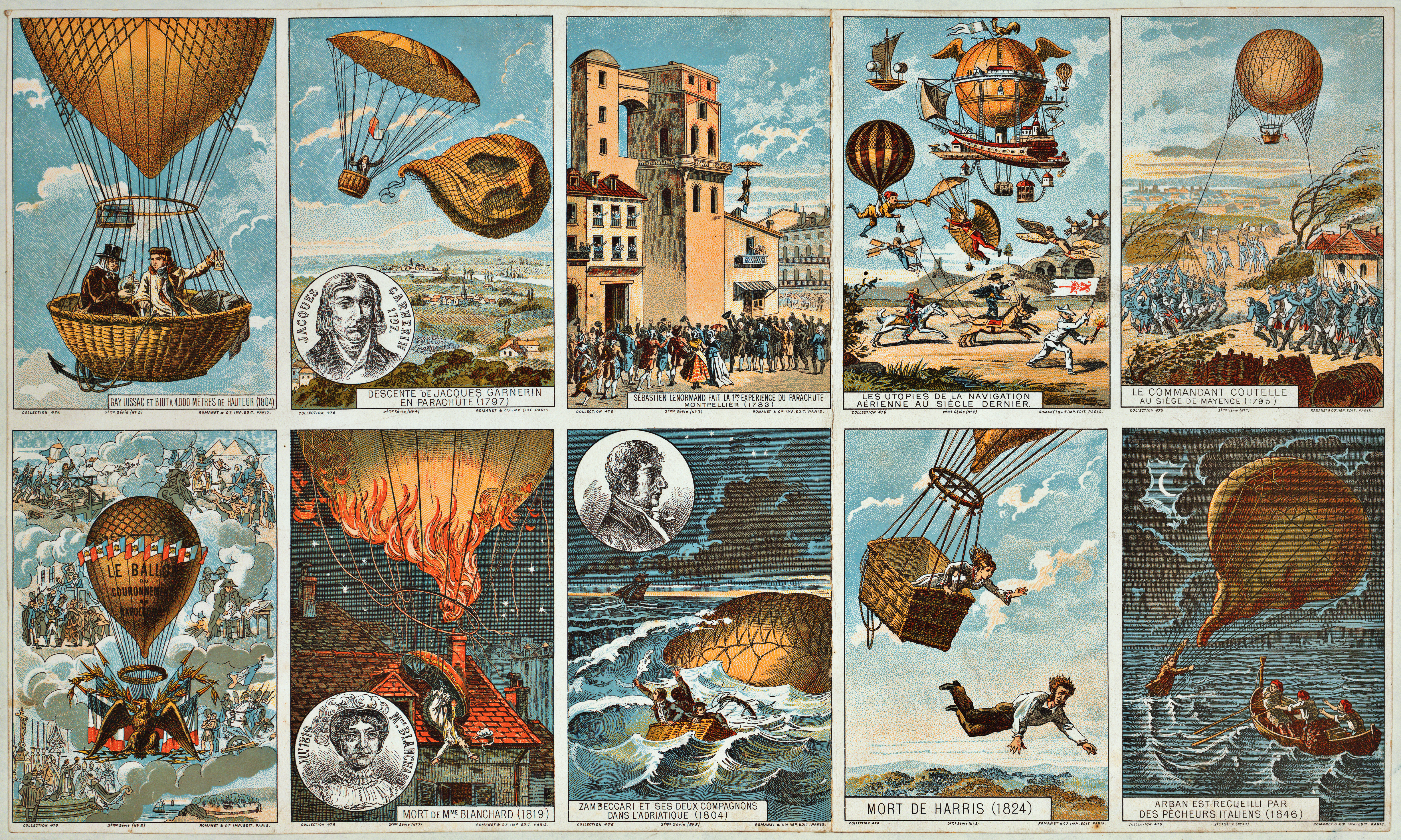